The 20 Best Fonts for a Modern and Impactful Website in 2025

Documentation
June 16, 2025
2 min
Visual overview of several modern web typefaces in 2025, each displayed on a vibrant background: Editorial New, DM Serif Display, Aeonik, SF Pro Rounded, Rader, Champ, Monument, Canicule, Clash Display, Supply, Agrandir, and more — a graphic composition highlighting typographic diversity.
Key points

Choosing the right typeface for your website isn’t just a matter of taste. It’s a strategic decision that directly impacts readability, brand perception, and user experience.

Typography plays a key role in web design. It sets the tone, structures content, creates visual rhythm, and—most importantly—gives your website a real identity. A well-chosen font can be the difference between a forgettable site and one that leaves a lasting impression.

At Digidop, a Webflow and design agency, we’ve handpicked the 20 best fonts for a website in 2025. These fonts are modern, readable, bold, and perfect for standing out.

1. Aeonik – CoType Foundry

“Aeonik” in a sleek neo-grotesque sans-serif font, over a surreal blue-toned abstract forest background — blending modernity with mystery and tech elegance.

Modern and highly structured sans-serif. It gives a professional, clean, and graphic look. It’s the one we chose for our own site at Digidop.

2. Canicule Display – Lift Type

“Canicule” in a soft, vintage-inspired serif font, superimposed on a decayed, sunlit interior of an old building — evoking warmth, nostalgia, and timeless charm.

Expressive and full of character. Ideal for high-end or artistic projects.

3. Satoshi – Fontshare

“Satoshi” in a neutral, highly readable sans-serif font, displayed over a golden seaside sunset — representing clarity, simplicity, and digital balance.

Minimalist and open-source. Simple without being bland. A UI classic.

4. Migra – Pangram Pangram

“Migra” in a refined, high-contrast serif typeface, laid over a geometric architectural detail with warm lighting — fusing classic sophistication with modern design.

A dynamic and confident serif.

5. Clash Display – Fontshare

“Clash Display” in a strong and contemporary sans-serif typeface, layered over an aerial view of intersecting highways — suggesting structure, dynamism, and clarity.

A modern font with strong visual impact.

6. Instrument Serif – Instrument

“Instrument Serif” in elegant serif font, displayed over a scenic mountain range at sunset with a visible full moon — conveying a refined, editorial style.

Contemporary and refined. A great choice for editorial interfaces or premium branding.

7. SF Pro Rounded – Apple

“SF Pro Rounded” in a clean, modern rounded sans-serif font, set against a starry night sky and silhouetted pine trees — evoking a friendly and tech-forward atmosphere.

Reassuring and accessible. Perfect for tech products.

8. Editorial New – Pangram Pangram

“Editorial New” in a high-contrast serif typeface, placed over a lush coastal mountain landscape — combining timeless elegance with a natural editorial flair.

Structured serif with a tone that’s both modern and classic.

9. Champ – Sharp Type

“Champ” in a bold, geometric sans-serif font, presented over a bright meadow with tulips and a large tree — reflecting joy, freshness, and approachability.

Compact sans-serif with strong personality.

10. Neue Montreal Mono – Pangram Pangram

“Neue Montreal Mono” in a monospaced font, over a blurred black-and-white urban night scene — evoking a techy, minimal, and underground mood.

Modern monospaced font. Great for tech interfaces or developer-friendly projects.

11. Rader – Future Fonts

“Rader” in a futuristic, modular sans-serif font, placed over a dense and misty green forest — suggesting innovation, contrast, and bold clarity in nature.

Minimalist and stylish sans-serif. Ideal for sharp creative directions.

12. DM Serif Display – Google Fonts

“DM Serif Display” in a high-contrast serif typeface, over ancient desert ruins with a clear blue sky — combining elegance with heritage and timeless storytelling.

A timeless classic. Perfect for bold headings.

13. Monument – Pangram Pangram

“Monument” in a bold, geometric sans-serif font, placed over houseplants lit by warm, directional light — evoking modernity, design simplicity, and indoor minimalism.

Inspired by brutalist architecture. For a bold and modern artistic direction.

14. Clash Grotesk – Fontshare

“Clash Grotesk” in a neutral, clean grotesque sans-serif font, set over a blurred dynamic background with warm lights — capturing modern movement and understated confidence.

Clean and efficient sans-serif. Ideal for modern or tech-oriented companies.

15. Mori – Pangram Pangram

“Mori” in a friendly sans-serif typeface, laid over a tranquil snow-covered mountain range — expressing clarity, calm, and harmonious balance in design.

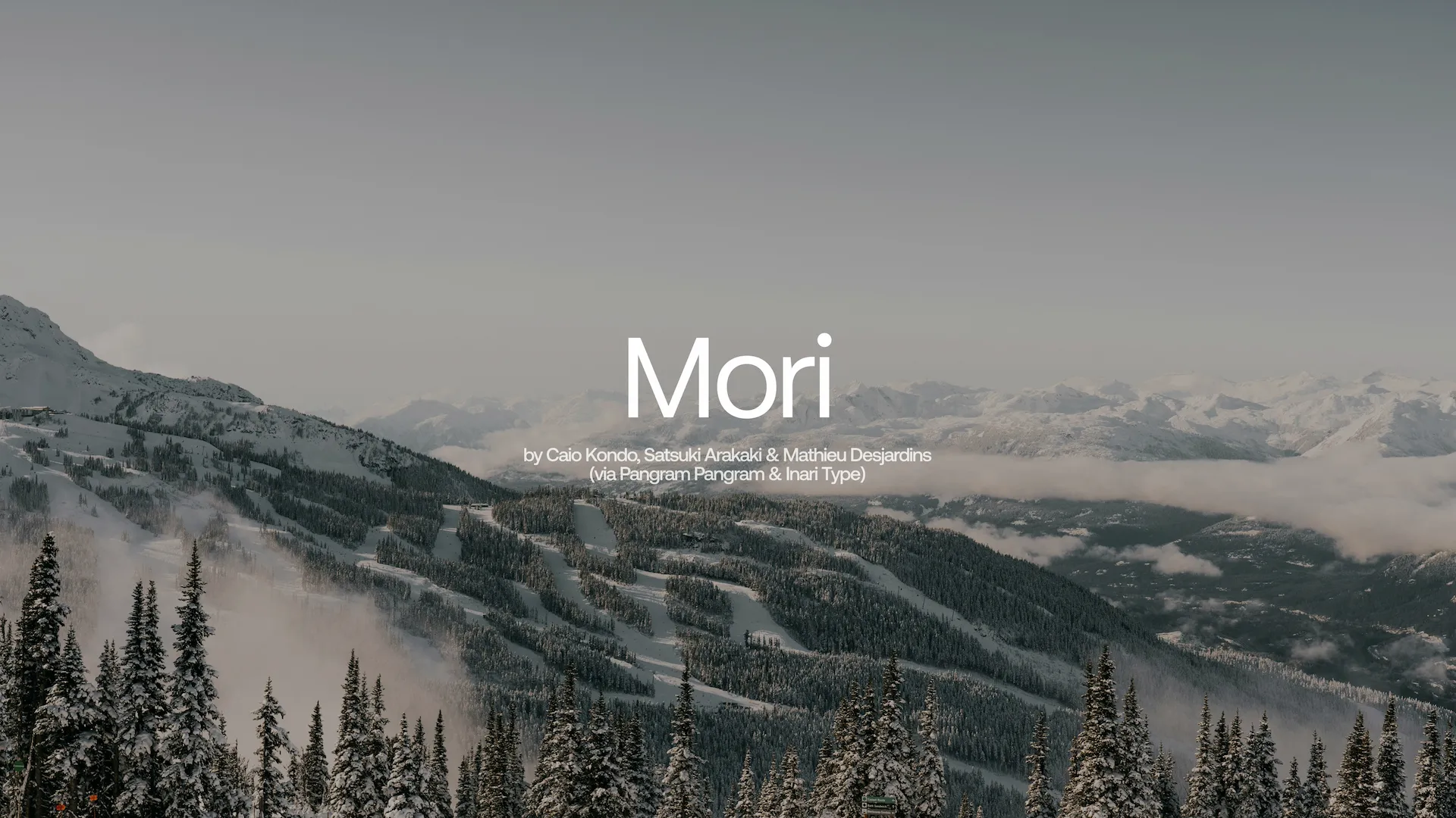
A font inspired by contemporary Japanese design.

16. Bricolage Grotesque – Google Fonts

“Bricolage” in a unique and contemporary serif/sans hybrid, over a carousel facade in front of ornate European buildings — highlighting creative contrast and eclectic style.

A neo-grotesque sans-serif with variable styles. It balances calm and quirkiness—ideal for original, human, slightly offbeat interfaces.

17. Geist – Vercel

“Geist” in a modern neutral sans-serif font, over a desert landscape with Joshua trees and boulders — clean, timeless, and built for tech-forward UI design.

Created and used by Vercel, this font is clean, modern, and perfectly suited for UI.

18. Manrope – Google Fonts

“Manrope” in a versatile geometric sans-serif font, placed over a sunlit minimalist interior with orange lounge chairs — suggesting balance, accessibility, and modern comfort.

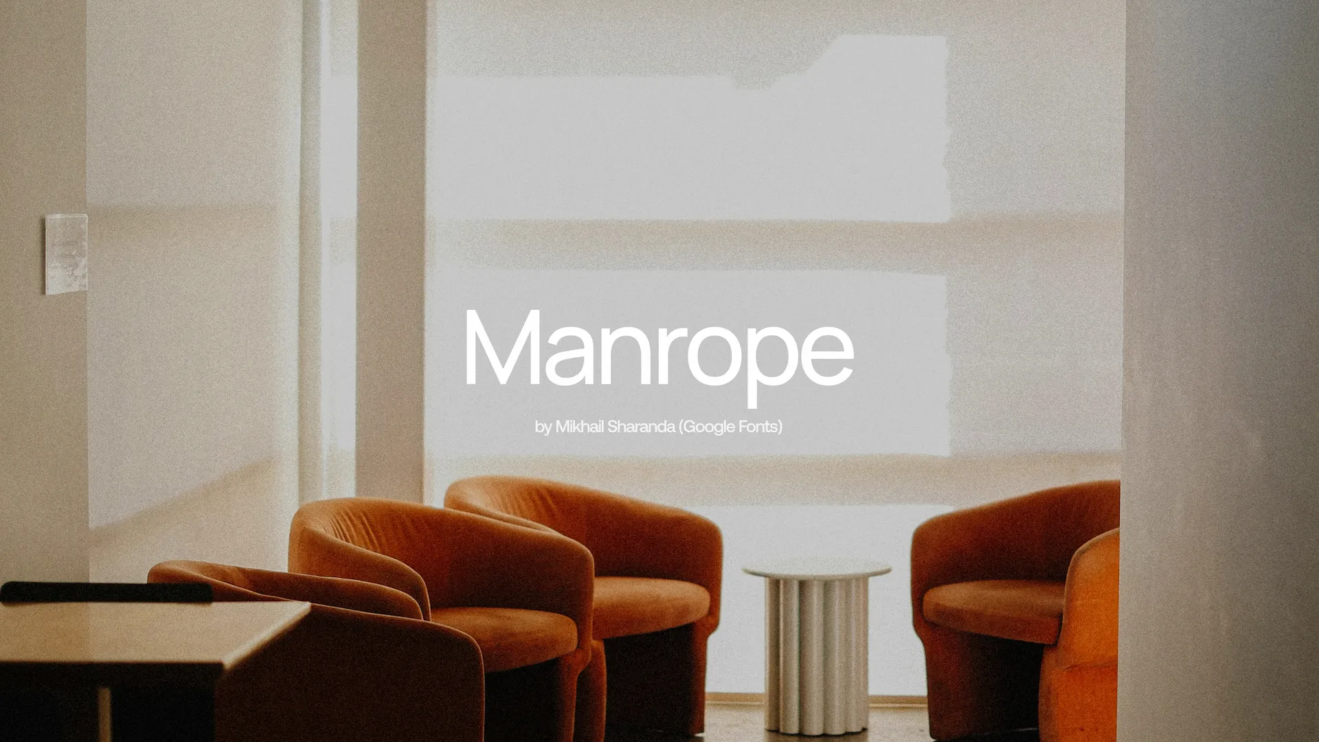
Robust, legible, open-source. A versatile essential.

19. Supply – Ohno Type Co.

“Supply” in a quirky sans-serif font with distinctive cuts, layered on a nighttime urban blur with motion trails — representing energy, functionality, and creative rhythm.

An industrial sans-serif with attitude. Great for bold tech identities.

20. Agrandir – Pangram Pangram

“Agrandir” in a bold, wide sans-serif typeface, shown over a close-up of a runner’s legs on a blue athletics track — evoking strength, motion, and expressive impact.

A humanist, expressive, and contemporary font. Perfect for creating an engaging tone.

Want to take it further with font pairing?

Picking the right font is crucial. But smartly combining two fonts (like one for headings, another for body text) helps reinforce hierarchy and harmony on your site. This technique, known as font pairing, is a cornerstone of modern web design.

It’s a topic we’ll cover in an upcoming article.

Want a modern, well-designed website with great typography?

At Digidop, we design Webflow sites built for conversion, clarity, and visual performance. Typography is at the heart of our design approach.

➞ Contact us to discuss about your project.

Quentin Ballereau
Quentin Ballereau
Interactive Designer & UI Specialist

Suggested articles

A woman speaks on stage at a conference, wearing a headset microphone. Behind her, a large black screen displays the question “What then?” in bold white text.
Events
Webflow

Digidop attends FLOWconf 2025, the biggest Webflow & marketing event in Europe.

Digidop attends FLOWconf 2025, the biggest Webflow & marketing event in Europe.
Mosaic of homepage designs from several Webflow agencies (Digidop, N4, Refokus, Flow Ninja, Tonik, Finsweet, Edgar Allan), showcasing diverse creative approaches and visual identities centered around the Webflow logo.
Storytelling
Webflow

My Top 7 Webflow Agencies in 2025 (From a Founder’s Perspective)

My Top 7 Webflow Agencies in 2025 (From a Founder’s Perspective)
AI Web Industry
2025 Analysis
Documentation
AI

AI Transforms Web Design Client Expectations: Comprehensive 2025 Market Analysis

AI Transforms Web Design Client Expectations: Comprehensive 2025 Market Analysis

Want to turn your website into your most valuable asset?

Contact us today