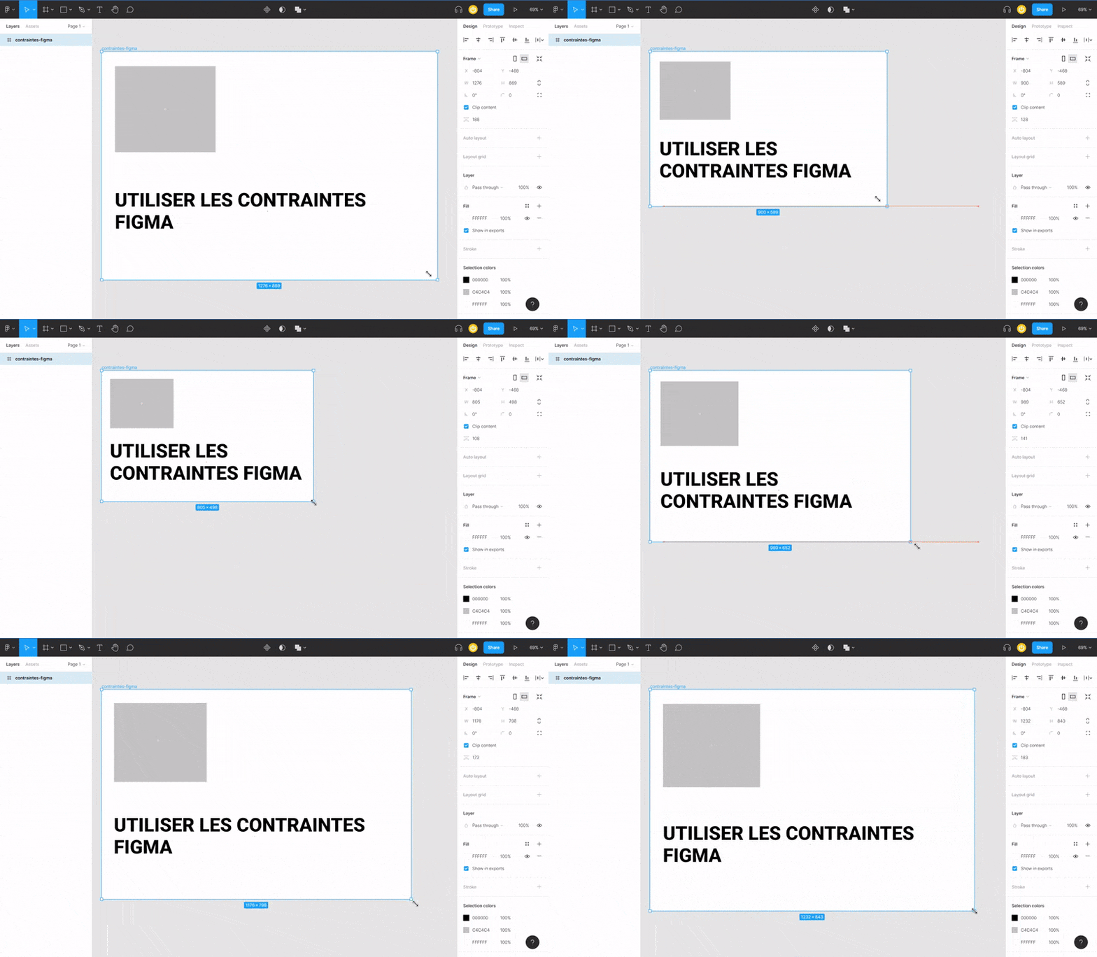
Constraints in Figma allow a child element to automatically resize in relation to its parent. Thus, when you stretch a Frame to resize it, the elements contained within that Frame will exhibit responsive behavior based on the defined constraints. This is a rather advanced tool in Figma that, once mastered, offers a significant productivity boost.
Whether for your UX and UI mockups, constraints are very effective tools for designing responsive web interfaces. These features will apply to all types of design elements such as images, components, text, buttons, groups, etc.
There are several types of Figma constraints you can use depending on the project’s needs. During the design, prototyping, and modeling phases, they will allow you to assign various responsive behaviors to one or more child elements: horizontal constraints and vertical constraints.
Horizontal Constraints
Horizontal constraints allow you to define how your layer will respond when you adjust your frame horizontally.
Here are the different horizontal constraints that you can apply to child elements:
- Left: fixes the position of your layer to the left side of the Frame. When you stretch your Frame to the left, the child element will follow.
- Right: fixes the position of your layer to the right side of the Frame. When you stretch your Frame to the right, the child element will follow.
- Left and Right: maintains the layer's position when you modify the Frame from both the left and the right. However, this may affect the layer's size, enlarging or shrinking it.
- Center: maintains the layer's position relative to the horizontal center of the Frame.
- Scale: the size and position of your child element will be adjusted proportionally (as a percentage) to those of the Frame. For example, consider a Frame of 100 px containing a layer of 80 px. In this case, the child element represents 80% of the Frame. If the Frame is increased to 200px, or +20%, the layer will increase to 160 px, also +20%.
Vertical Constraints
Vertical constraints in Figma will allow you to define how a child element will react when the vertical dimensions of the Frame are altered.
There are several types of vertical constraints:
- Top: fixes the position of the layer to the top of the Frame.
- Bottom: fixes the position of the layer to the bottom of the Frame.
- Top and Bottom: maintains the layer's position when you modify the Frame from both the top and the bottom. However, this may affect the layer's size, enlarging or shrinking it.
- Center: maintains the layer's position relative to the vertical center of the Frame.
- Scale: similar to horizontal scaling, the size and position of your layer will adjust proportionally to those of the Frame.
Uses of Constraints in Figma
Figma constraints apply to any element contained within a Frame:
- Layers within a Frame
- Frame within a Frame
- For your groups
Constraints can be used to define how your elements will respond in your prototypes, for example, when you create animations.
Adding Constraints in Figma
- Select the child element contained within the frame. In the design sidebar (to the right of your screen), you will see a section titled “Constraints.”
- The blue notches represent the horizontal and vertical constraints applied to your layer. You can either adjust your vertical and horizontal constraints by clicking on the interactive dashes; or adjust them by selecting your constraints from the dropdown lists.
- The “Fix position when scrolling” option allows you to lock the position of your layer while scrolling. This allows you to create “Sticky Elements” on your site.

Ignoring Constraints in Figma
Sometimes you may need to resize your frame or layer without affecting the other elements. Instead of removing the constraints one by one, use the following keyboard shortcuts while resizing:
Mac: Hold “Cmd” + resize
Windows: Hold “Ctrl” + resize
.webp)


.webp)