Too often, conversion decisions are based on gut feeling. But this “intuitive” approach leads to many unseen mistakes. Mistakes that directly impact your conversion rate. And in a world where traffic is more expensive, competitive, and complex than ever, improving conversion is more profitable than increasing visitors.
That’s where a well-executed A/B testing strategy makes all the difference.
Project Challenges
A website redesign, no matter how successful, is still based on assumptions. It’s only once the site is live that you can observe real user behaviors. The challenge here: shifting from an intuitive approach to a continuous optimization strategy, driven by real data and validated through A/B testing.
Tracking
👉 What user events should you track?
👉 Which tools combine qualitative (session recordings, heatmaps) and quantitative (funnels, goals) analysis?
👉 How do you read this data to make better decisions?
Optimization
👉 Prioritize UX hypotheses based on business potential and complexity.
👉 Define clear KPIs per test and measure real impact.
👉 Quickly implement winning variants and iterate continuously.
Our Approach with Ramify
With Ramify, we structured a 4-phase CRO strategy, combining insights, testing, and rollout.
Phase 1: Understand & Analyze
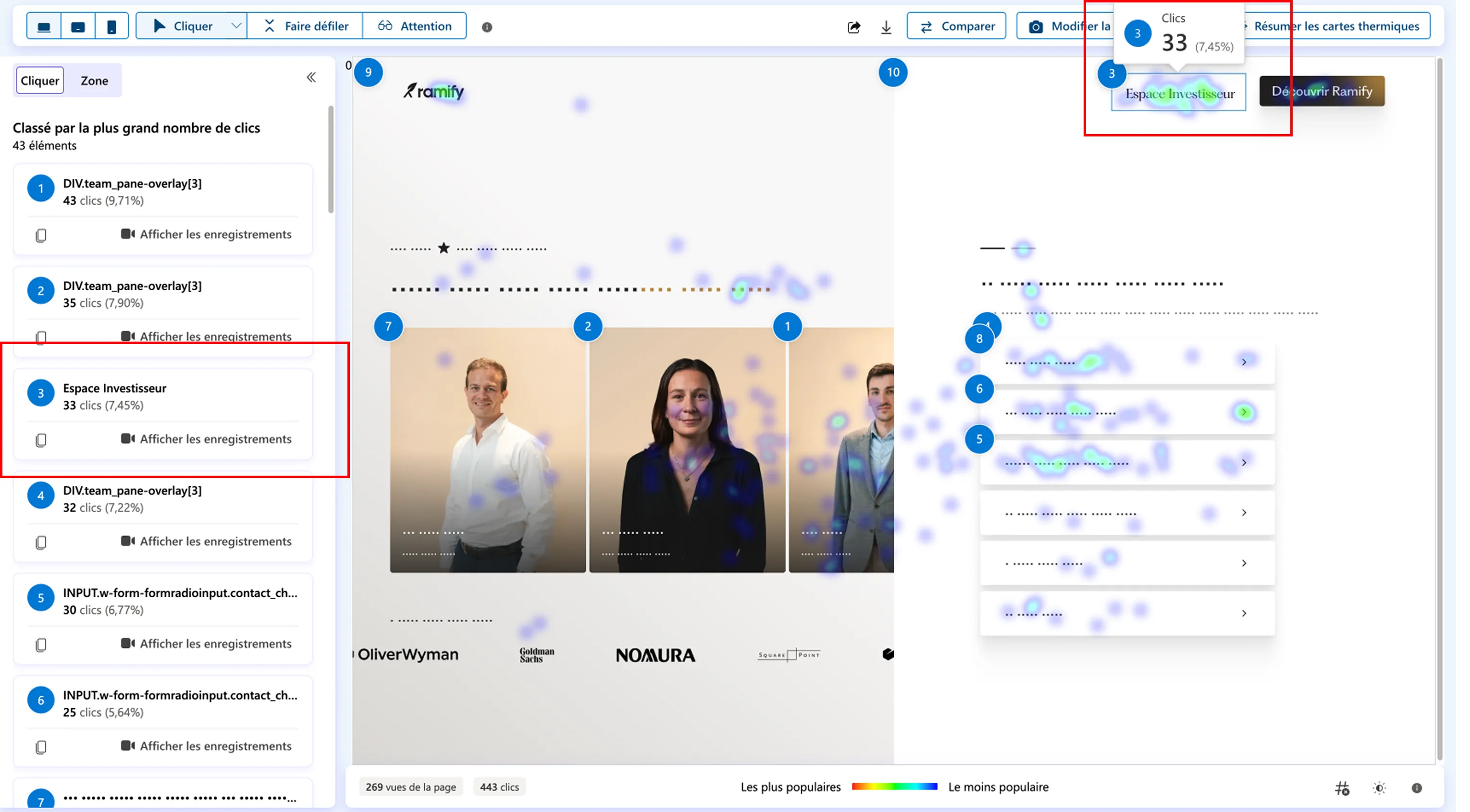
Before optimizing, you need to understand what actually needs to be optimized. We started by integrating two complementary tracking tools:
These insights helped us:
- Map user micro-journeys and pinpoint critical friction areas.
- Prioritize UX hypotheses by potential impact vs effort required.
Phase 2: Challenge Conversion Drivers
Once key friction points were identified, we launched a series of A/B tests to challenge what could genuinely move the needle.
Each test had clear performance and behavioral KPIs: click-through rate on target elements, funnel progression, final conversion rate, scroll depth, time-on-section, etc.
Phase 3: Test Execution
We selected Optibase to run the A/B tests — a lightweight, Webflow-native testing tool:
- Webflow-native integration: deploy test variants without tech debt or developer bottlenecks.
- Real-time stats: built-in uplift tracking, p-value, and confidence intervals — GDPR-compliant.
- Budget-friendly: flexible licenses, perfect for mid/high traffic sites looking to scale testing without blowing the CRO budget.
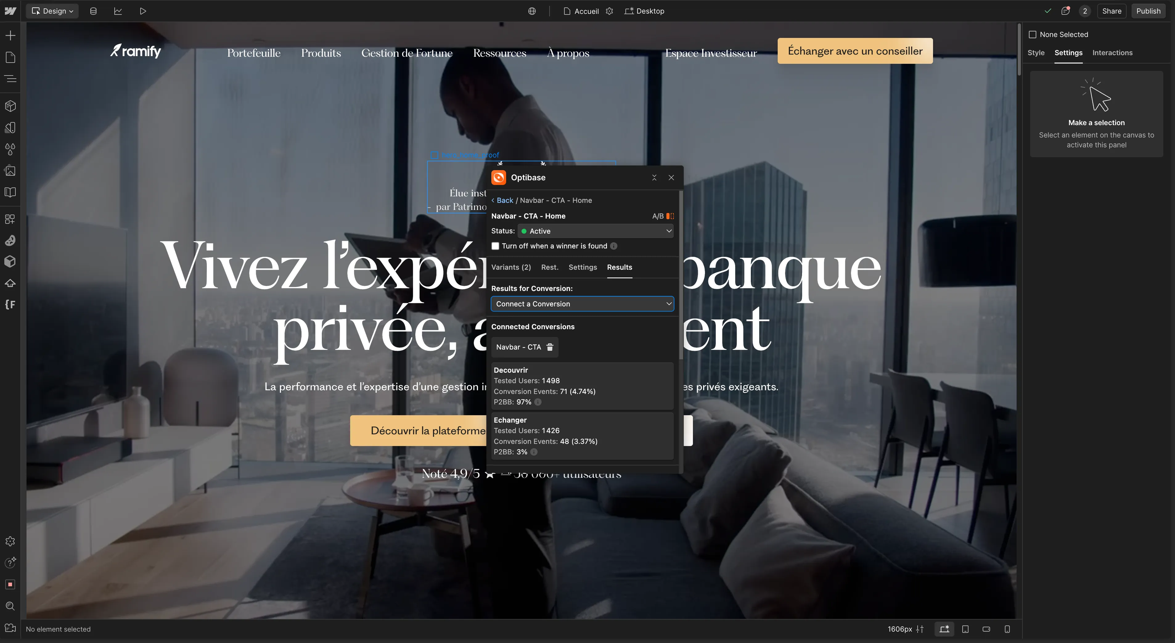
Phase 4: Test Results & Iteration
1. Main Navbar CTA: “Explore” vs “Contact”
Which top-of-page CTA drives the most conversions? A/B test on the primary navbar button.
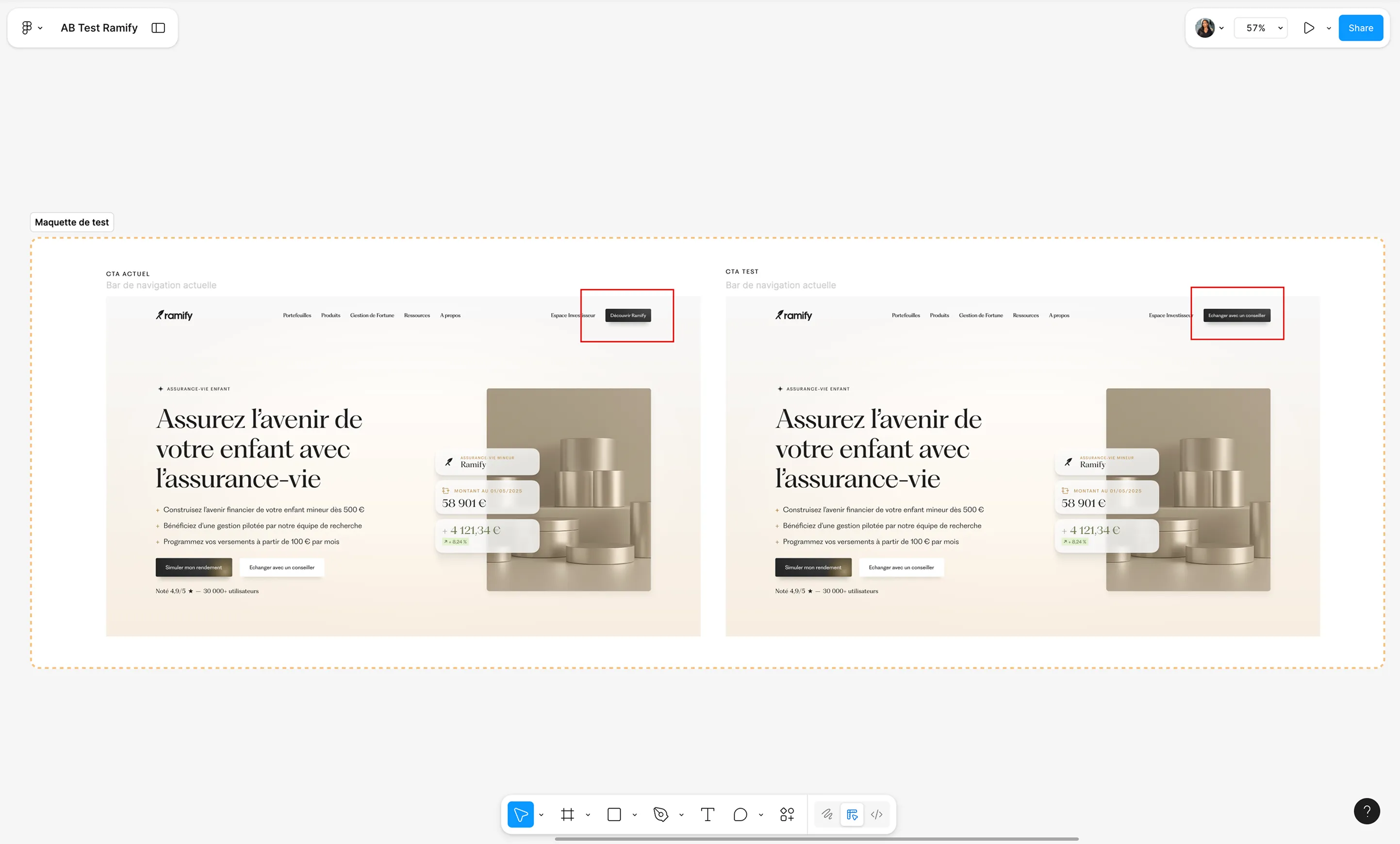
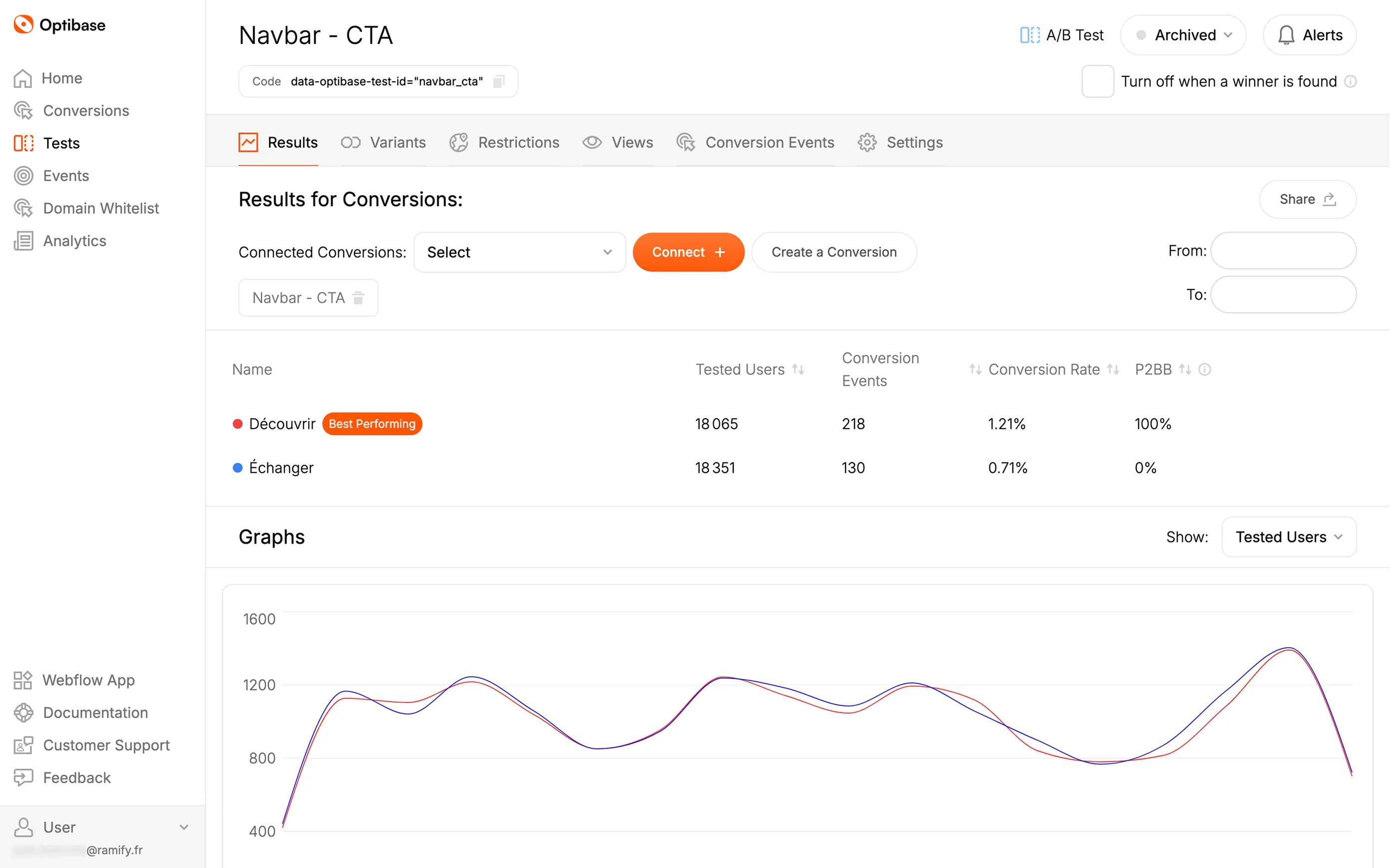
📊 Explore: 1.21% click rate
📊 Contact: 0.71%
👉 Result: “Explore” became the default CTA across key conversion pages.
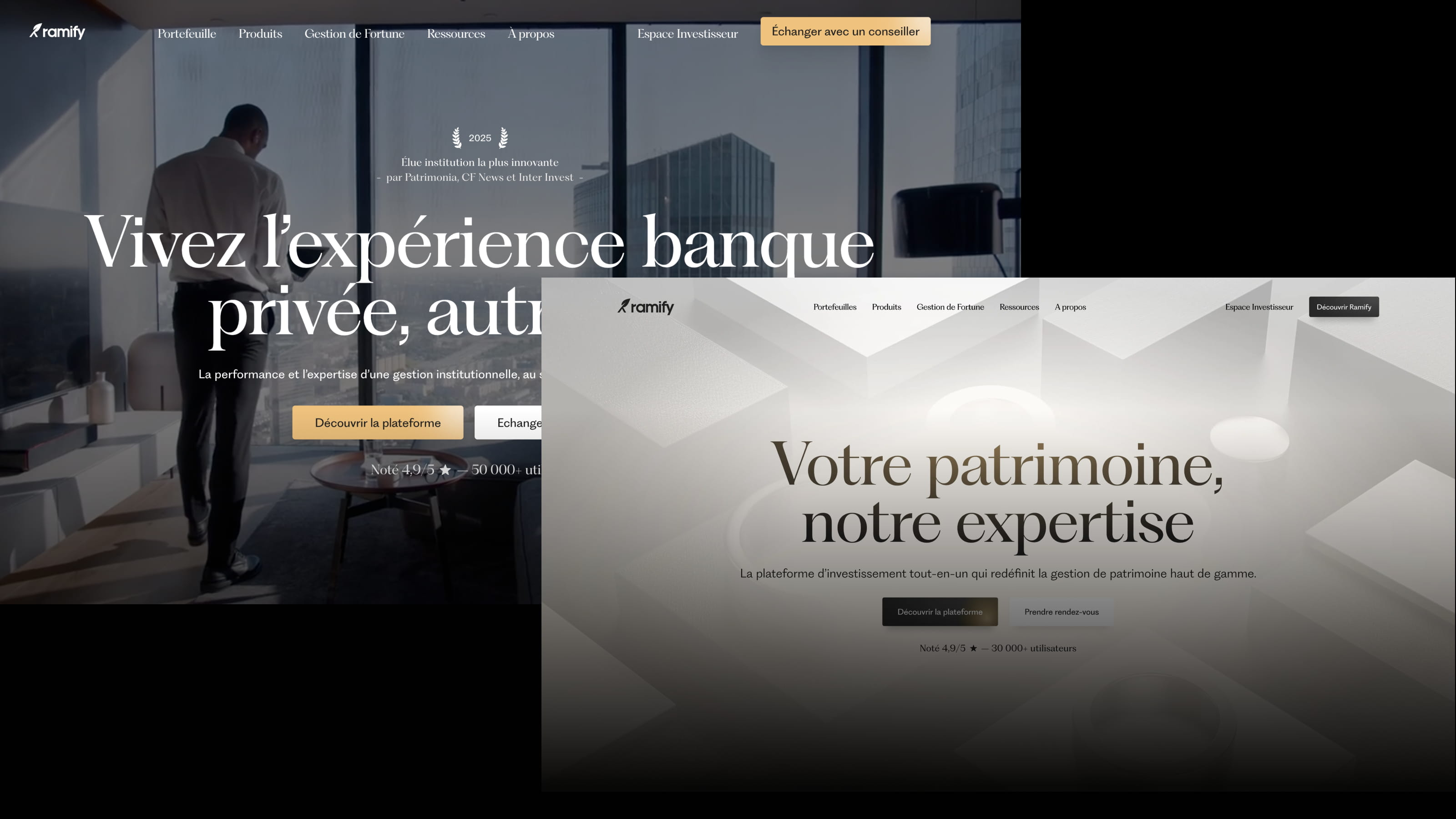
2. Hero Header: Static Image vs. Background Video
Which media format captures more attention and drives more header CTA clicks (primary KPI)? Tested on homepage hero.
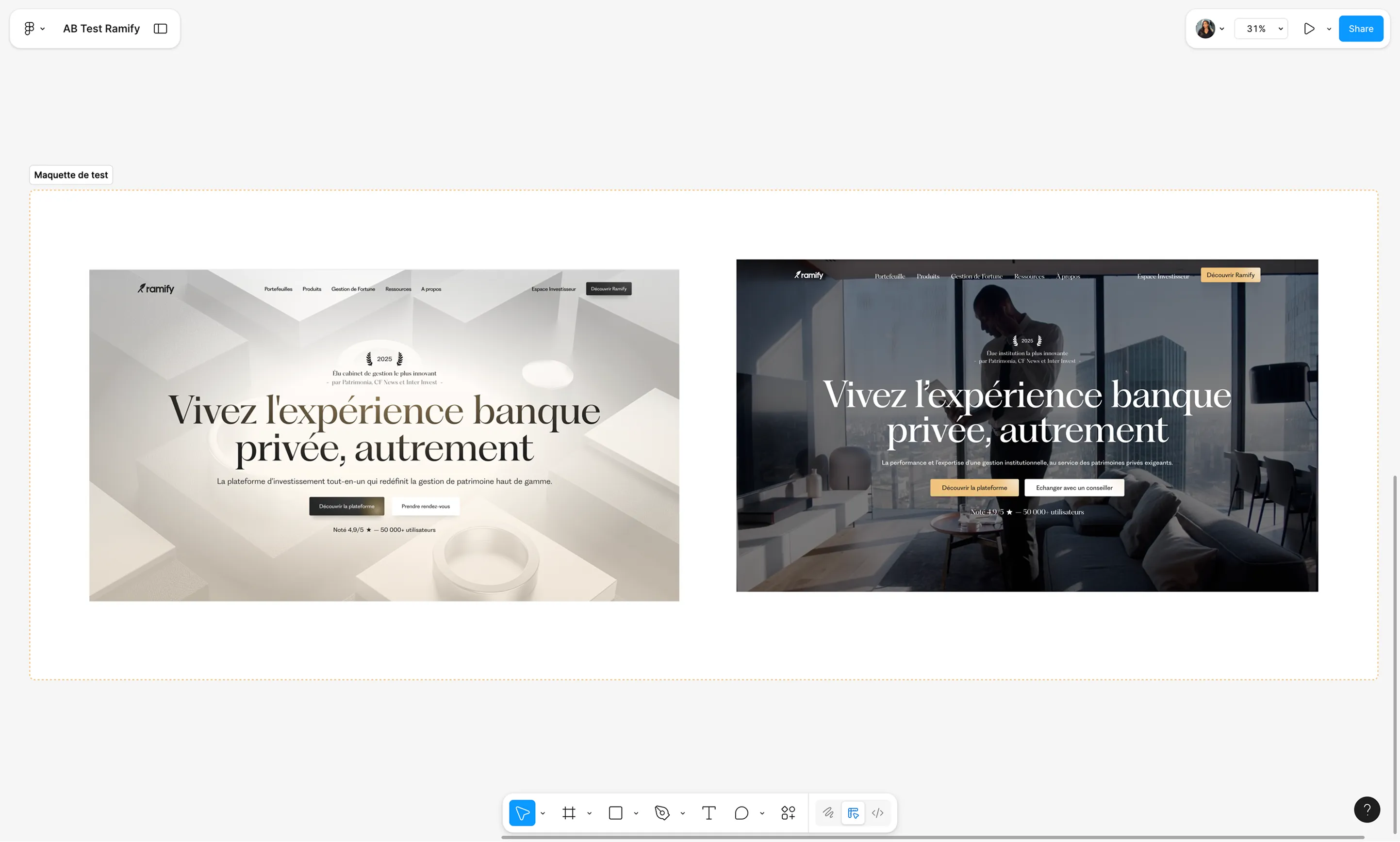
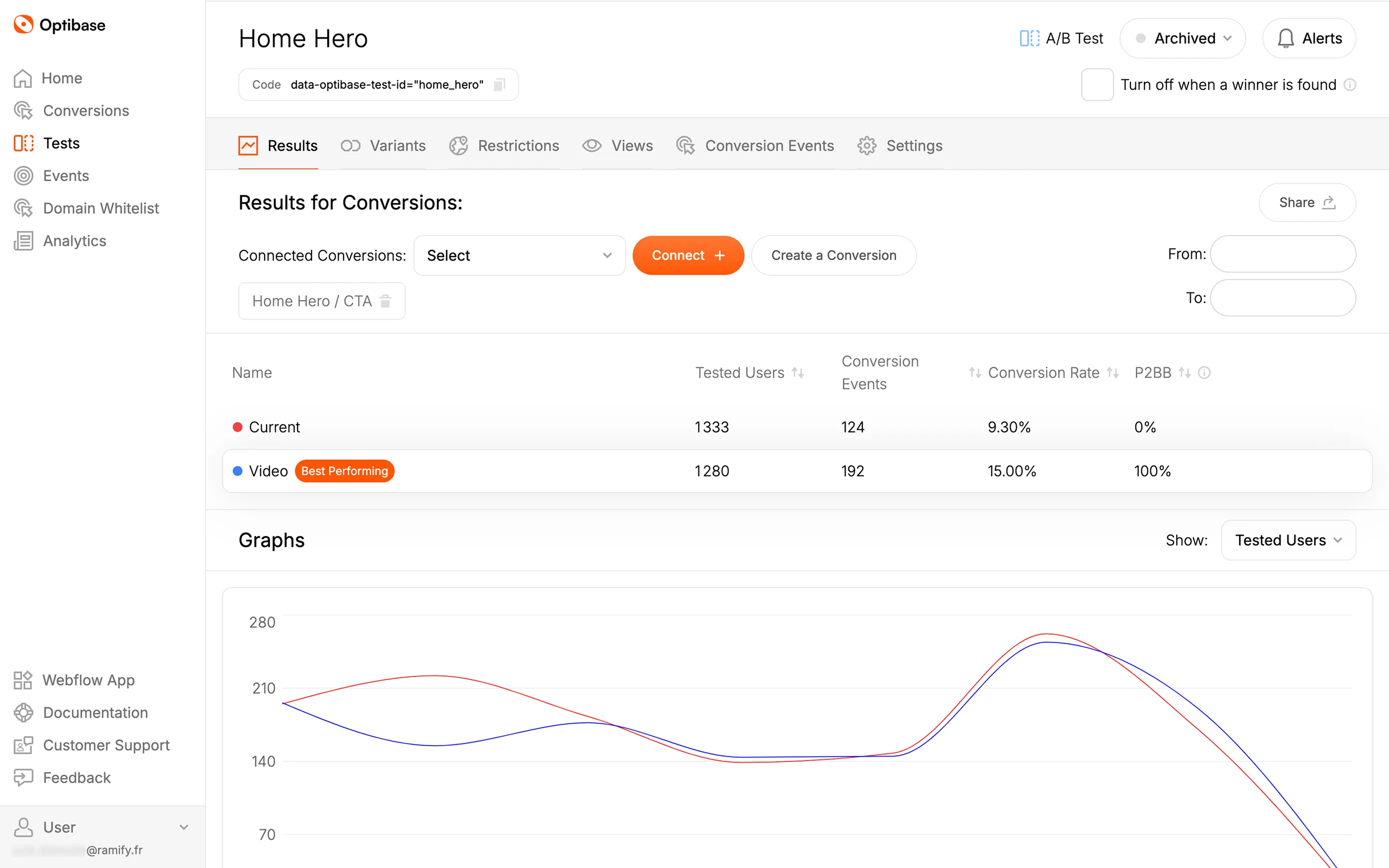
📊 Static Image: 9.37% conversion
📊 Immersive Video: 15.01%
👉 Result: Background video integrated across all high-impact pages.
3. Contact Form CTA: “Investor” vs “Back”
Was the “Investor” CTA being misunderstood as a “Back” button?
We noticed abnormal usage of the “Investor” CTA. To test the confusion, we added a dedicated “Back” button.
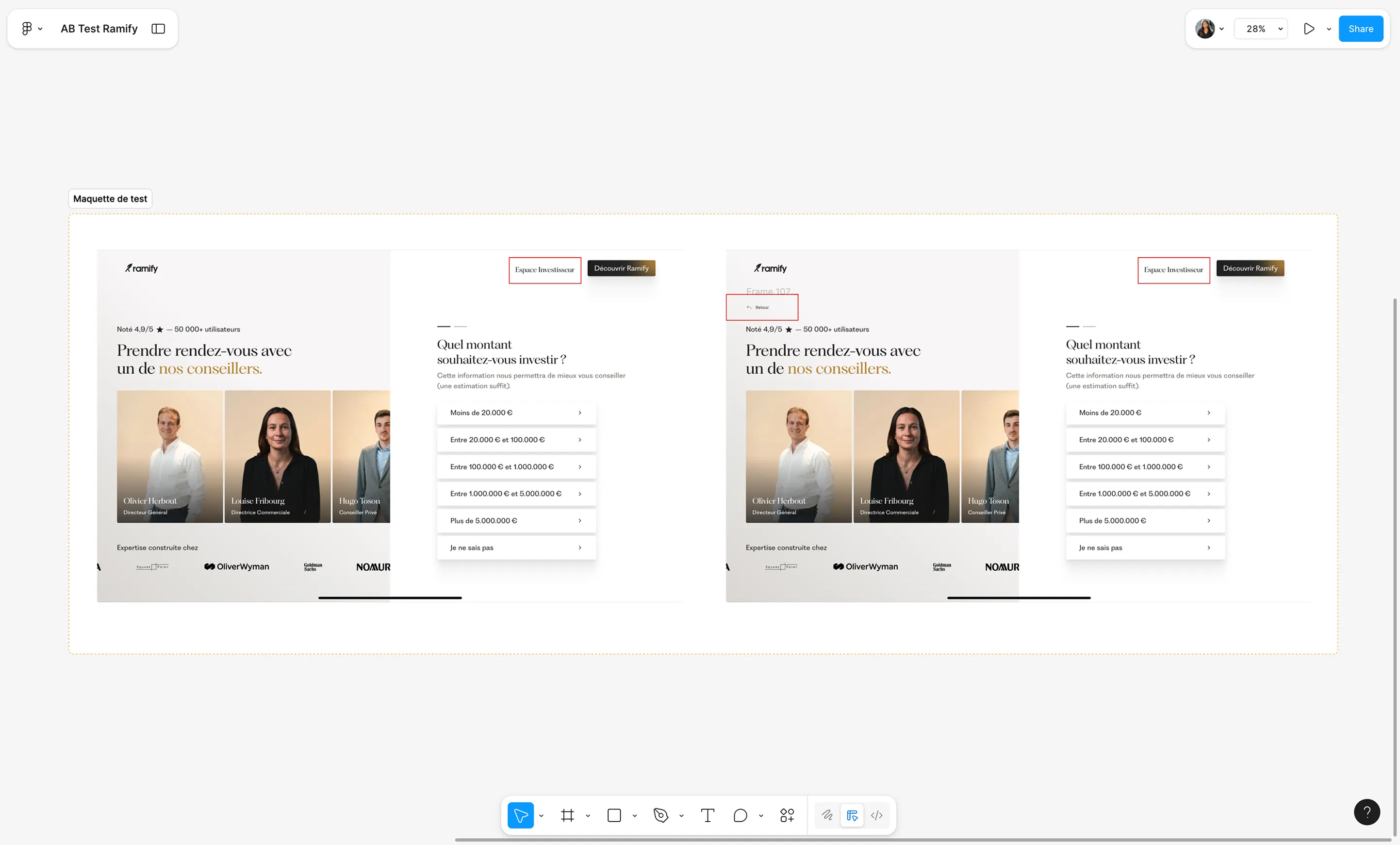
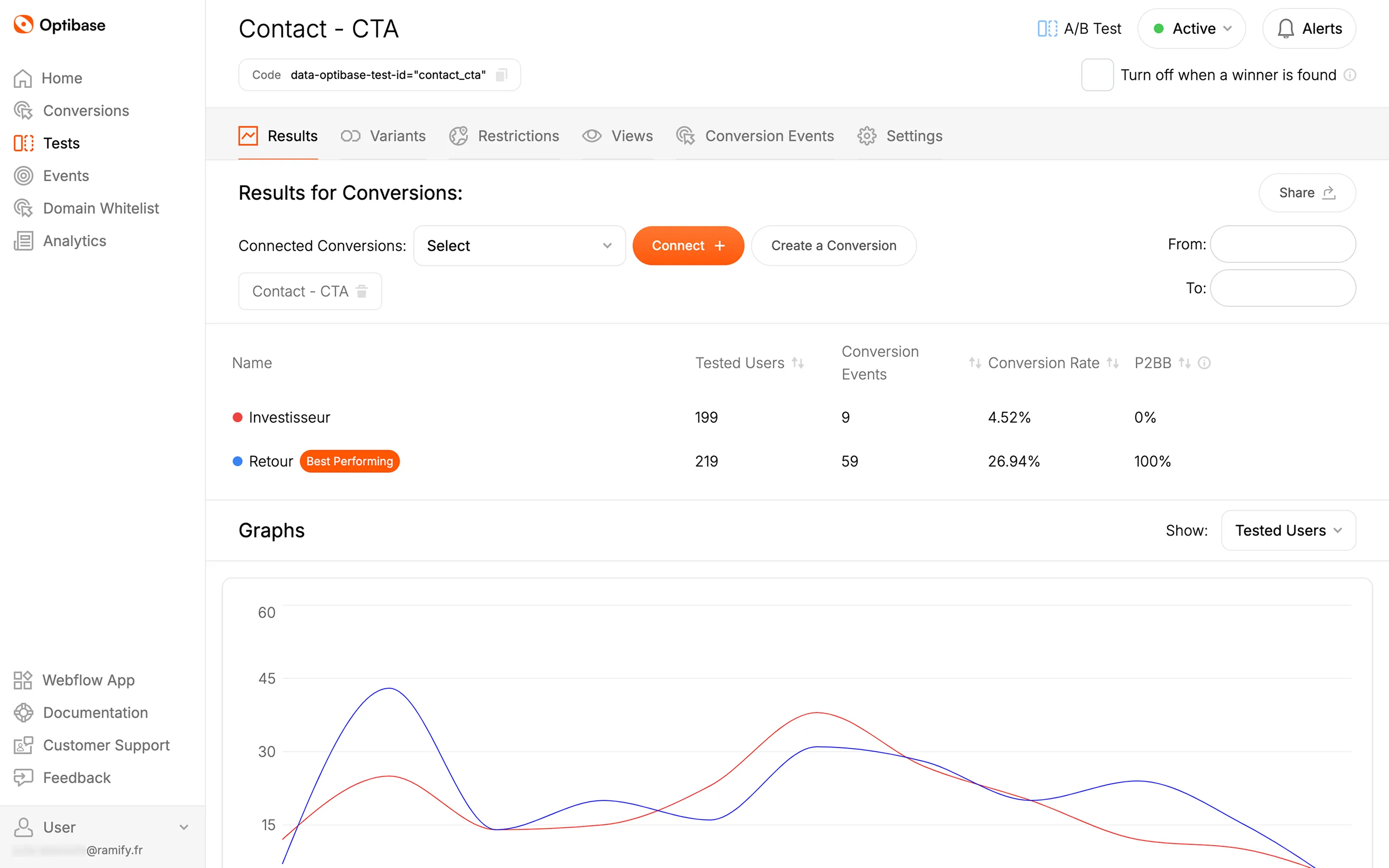
📊 Back: 26.94% click rate
📊 Investor: 4.52%
👉 Result: Navigation clarified to remove confusion and reduce friction in the contact funnel.
Conclusion
After Ramify’s global redesign, we launched a second phase focused entirely on conversion rate optimization.
Thanks to Optibase’s native Webflow integration and solid incoming traffic, we were able to run weekly A/B tests, analyze results in real-time, and iterate quickly. A strategy that enabled Ramify to triple its assets under management (AUM) within one year.
Further CRO Resources:


.jpg)

.jpg)
