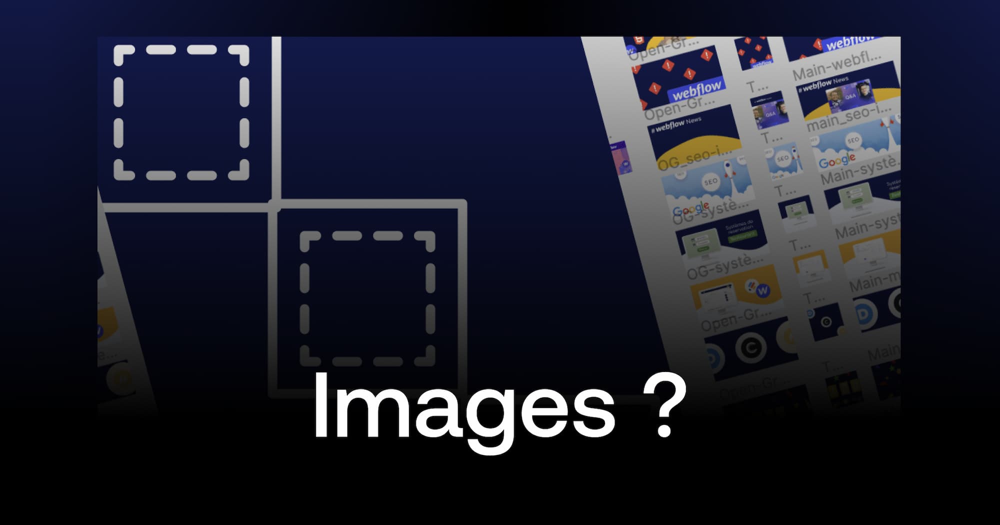
Web Image Optimization in 2025
Optimized images now constitute a fundamental pillar of SEO and user experience. With 83% of Google traffic now coming from mobile devices and generalized mobile-first indexing, respecting proper dimensions becomes strategic for visibility and performance.
Google's Core Web Vitals now integrate image loading speed into ranking calculations. A poorly sized image can increase loading time by 3 seconds, causing 53% of mobile visitors to abandon the site according to 2025 Google PageSpeed Insights data.
Essential Images for Your Website
Favicon: The Miniature Visual Identity
The favicon remains the most visible graphic element of your online identity. Displayed in tabs, bookmarks, and search results, it reinforces brand recognition with every interaction.
Recommended dimensions: 32x32 pixels minimum, with multiple versions advised (48x48, 96x96, 144x144 pixels) to adapt to different screen densities. ICO and PNG formats offer the best browser compatibility in 2025.
The common mistake is to directly provide a 16x16 pixel favicon. Modern browsers resize automatically, but starting with a larger source image (32x32 minimum) ensures optimal sharpness across all platforms.
Apple Webclip: Optimized iOS Experience
The Webclip corresponds to the icon that displays when an iOS user adds your site to their home screen. This often-neglected feature significantly improves mobile Apple visitor engagement.
Ideal size: 256x256 pixels in PNG format. This dimension ensures sharp display on all current iOS devices, from iPhones to iPad Pros. Center important elements of your logo to avoid automatic cropping.
Blog Article Images: Performance and Readability
Article images often represent the largest volume of multimedia files on a site. Their optimization directly impacts performance and SEO.
Maximum recommended width: 1920 pixels for full-width images. This dimension corresponds to the most common screen resolution in 2025. For images integrated into content, adapt the width to your text container (generally between 800 and 1200 pixels).
WebP and AVIF formats reduce file size by 25 to 35% compared to traditional JPEG, while maintaining equivalent visual quality. Implement lazy loading to defer loading of images not immediately visible.
Open Graph: The Art of Social Sharing
Open Graph images automatically display when sharing your pages on social media. They directly influence click-through rates and social engagement.
Universal format: 1200x630 pixels with 1.91:1 ratio. This dimension works perfectly on Facebook, LinkedIn, and Twitter (X) in 2025. Instagram and Pinterest may require specific adaptations.
Center important textual and visual elements to avoid automatic cropping on mobile. Test your images with Facebook and LinkedIn debugging tools before publication.
Optimizing for Google My Business
Local Business Logo
The GMB logo appears in local search results and on Google Maps. Its quality directly influences the professional perception of your business.
Ideal dimension: 250x250 pixels in square format. Favor PNG formats with transparency for harmonious integration on all Google backgrounds.
Your Business Photos
The GMB cover photo (1080x608 pixels) showcases your professional space, while additional photos (497x373 pixels) present your products and services. These visuals directly improve your local SEO and encourage physical visits.
YouTube: The Complete Video Ecosystem
Adaptive Channel Banner
The YouTube banner constitutes the most visible branding element of your channel. Its complexity lies in variable display across devices.
Optimal dimensions: 2560x1440 pixels with a safe zone of 1235x338 pixels in the center. This zone remains visible on all devices, from smartphones to 4K televisions. Position your logo and essential information in this secure zone.
Thumbnails: The Video Conversion Weapon
YouTube thumbnails largely determine your video click-through rates. They must be readable even in small format on mobile.
Standard format: 1280x720 pixels (16:9 ratio) with a maximum weight of 2 MB. Use contrasting colors, readable text, and eye-catching visuals. Thumbnails represent 90% of the click decision according to 2025 YouTube studies.
Channel Logo
The YouTube logo (800x800 pixels) displays as a circle in the interface. Center your design and avoid fine details that would become unreadable in the final 98x98 pixel format.
Modern Image Formats and Performance
WebP and AVIF: The New Standards
WebP and AVIF formats revolutionize web optimization in 2025. WebP offers a 25-30% reduction in file size compared to JPEG, while AVIF can achieve 50% compression gains.
Browser compatibility has become widespread: WebP works on 95% of current browsers, AVIF on 80%. Implement a fallback strategy with the picture element for older browsers.
Also learn how to convert your images into WEBP format in Webflow to create an even more efficient website!
Responsive and Mobile Adaptation
Responsive design requires images that adapt fluidly to different screen sizes. Use the srcset attribute to serve optimized versions according to device resolution.
High-density screens (Retina, Super AMOLED) require images 2x or even 3x wider than their final display. An image displayed at 400x300 pixels must be provided at 800x600 pixels to remain sharp on high-definition screens.
FAQ - Images sizes & formats
What is the maximum recommended size for web images in 2025?
1920 pixels maximum width for full-width images, with a file weight under 500 KB after compression. As 4K screens become mainstream, some contexts may justify 2500 pixel width, but optimization becomes critical.
Should I still use JPEG and PNG formats?
JPEG and PNG formats remain valid but WebP offers better performance. Implement WebP with PNG/JPEG fallback for maximum compatibility. AVIF becomes the format of the future for projects requiring extreme compression.
How do I optimize my images for mobile SEO?
Prioritize a mobile-first design with adaptive images via srcset, implement lazy loading, and use modern formats. Descriptive alt tags remain essential for accessibility and SEO. Test regularly with PageSpeed Insights Mobile.
Are SVG images recommended for all types of elements?
SVG excels for logos, icons, and simple illustrations thanks to their perfect scalability and small weight. Avoid them for complex photographs where bitmap formats (WebP, AVIF) offer a better quality-weight ratio.
What resolution should I choose for Retina and high-density screens?
Provide images 2x the display size for high-density screens. An image displayed at 400x300 pixels requires an 800x600 pixel source. Modern CDNs like Cloudinary or ImageKit automate this adaptation.
Advanced Optimization Strategies for 2025
Image optimization evolves toward a data-driven and automated approach. Intelligent CDNs now analyze device type, internet connection, and user preferences to automatically serve the optimal format.
Artificial intelligence integrates into optimization workflows: adaptive compression based on content, intelligent cropping for different formats, and automatic generation of variants. These technologies, accessible through services like ImageKit or Cloudinary, democratize advanced optimization for all developers.
The mobile-first approach becomes mandatory with Google's exclusive mobile indexing since 2024. Design first for small screens, then adapt to larger resolutions. This methodology guarantees optimal performance across all devices.
Core Web Vitals 2025 integrate new image-related criteria: Largest Contentful Paint (LCP) penalizes non-optimized images, Cumulative Layout Shift (CLS) sanctions images without explicit dimensions, and First Input Delay (FID) evaluates the impact of images on interactivity.
Sources and Resources
- Google Official Guide on Image Optimization - Complete technical documentation
- Web.dev - Modern image formats - WebP, AVIF comparisons and best practices
.webp)

.jpg)
