If there’s one thing everyone associates with finance, it’s numbers.
Numbers that often represent money, sometimes performance, but above all, numbers that play a key role in improving conversion, transparency, and trust on any financial website.
The goal of this article is to help you understand the challenges, solutions, and tools for integrating financial visualizations into a website.
1. Why Integrate Financial Charts into Your Website?
Whether you’re a bank, an insurance company, an investment fund, or a wealth management firm, there are three main reasons to include financial visuals on your website.
→ Argument 1: Data is a driver of transparency and trust.
Visual integration is an excellent way to showcase the performance of your offers, demonstrate your rigor, and, most importantly, build reassurance.
→ Argument 2: A tool for financial education and information
Depending on the format chosen, a chart can be a great way to make data readable and accessible, helping your visitors better understand sometimes complex financial topics.
→ Argument 3: A boost for your website’s KPIs
Websites that integrate data visualizations generally show better user retention, increased time on site, and higher conversion rates.
2. Overview of Financial Visualizations Used on the Web
There are several ways to integrate data into your website: static, semi-dynamic, and dynamic.
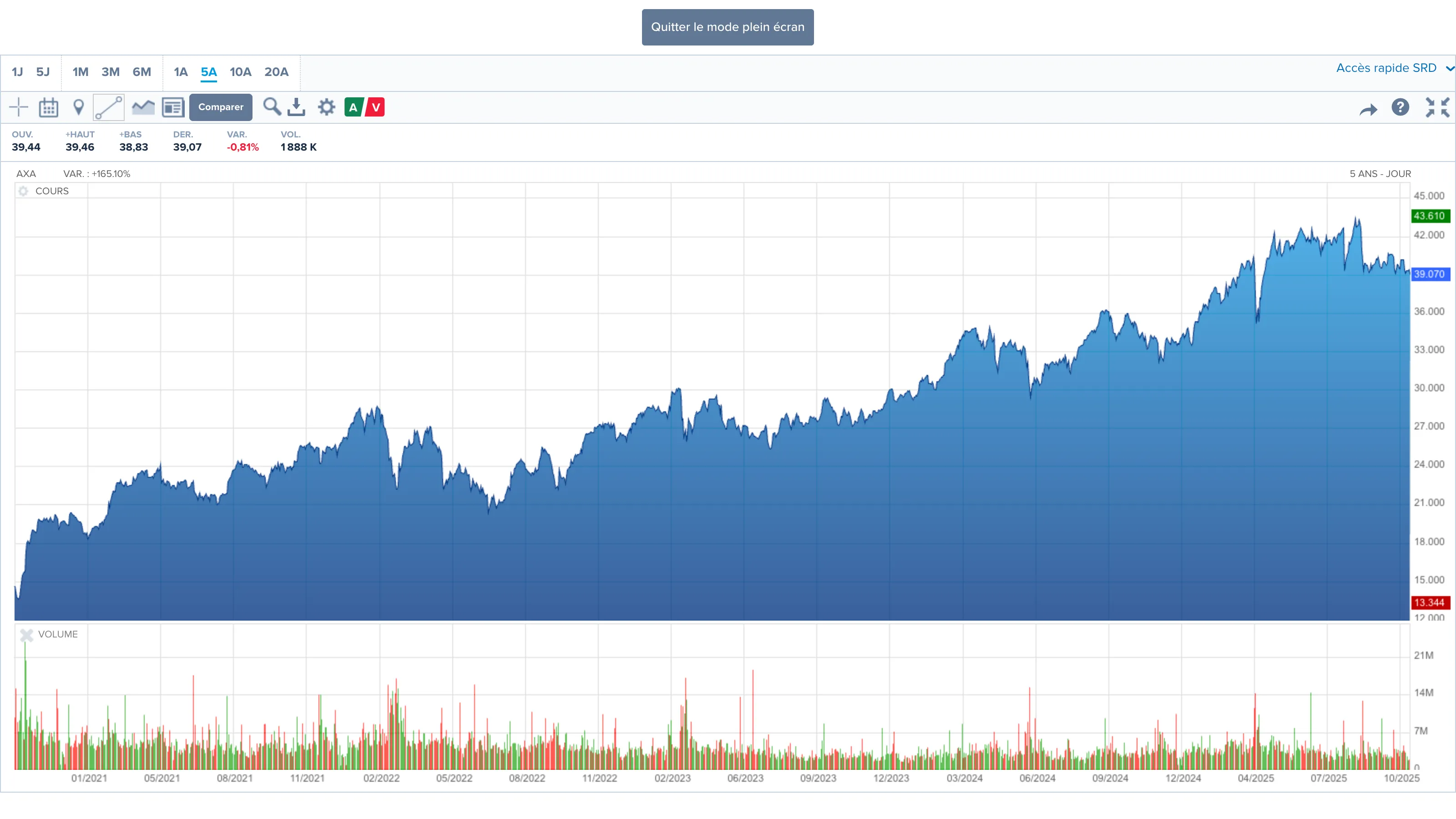
2.1. Static Charts
In the form of infographics, images, or tables, these are useful for visually presenting financial data.
Or Valhyr uses charts to display its geographic distribution and sector allocation.

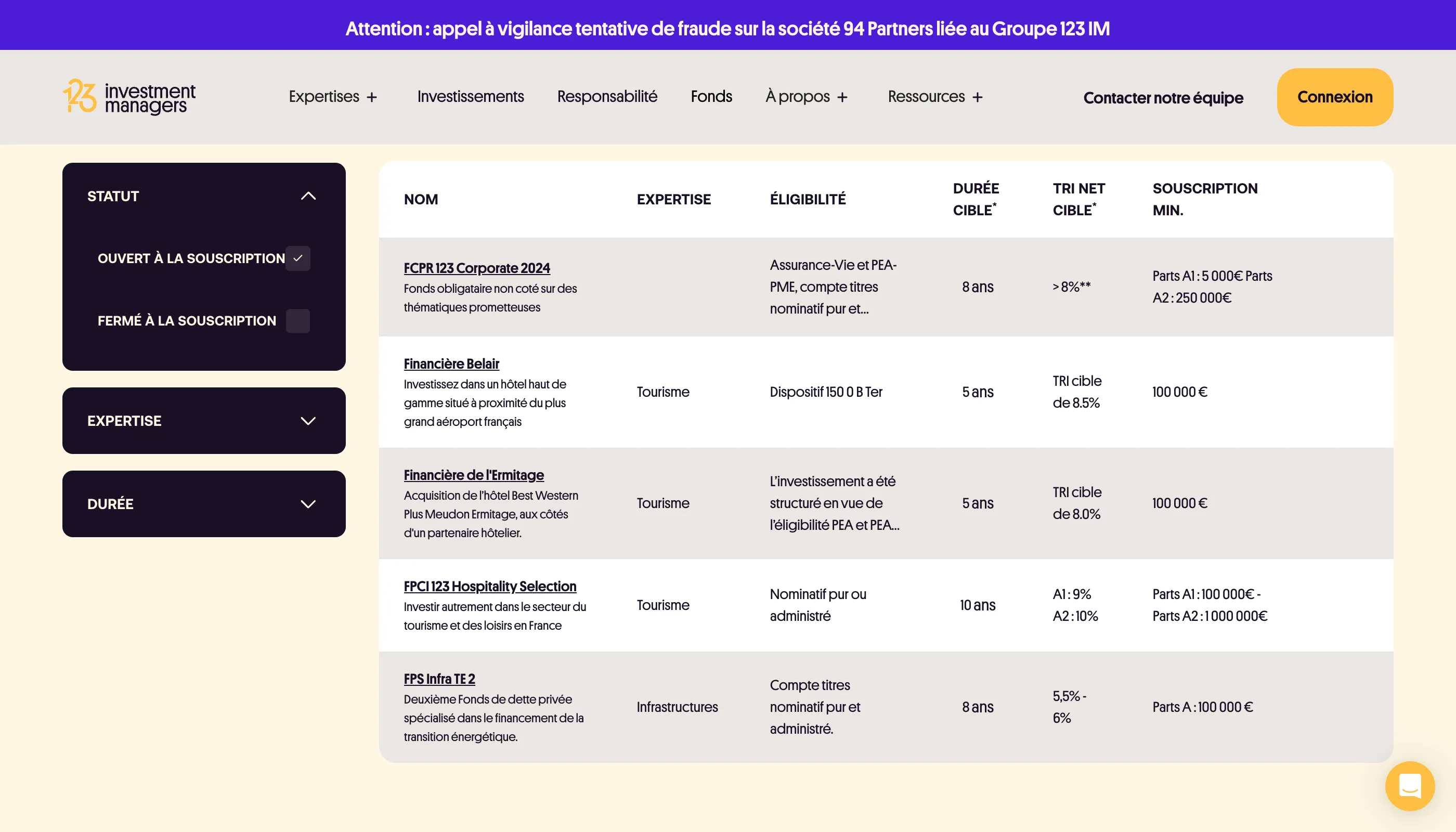
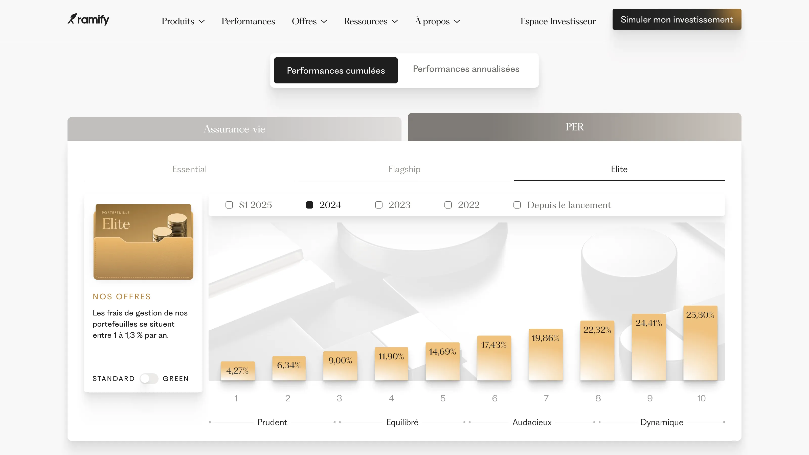
2.2. Semi-Dynamic Charts
Unlike static images or tables, semi-dynamic interfaces illustrate “static” data but with interactive tabs or subtle animations that enhance the user experience.
For example, 123 IM uses tables and filters to showcase its various funds.
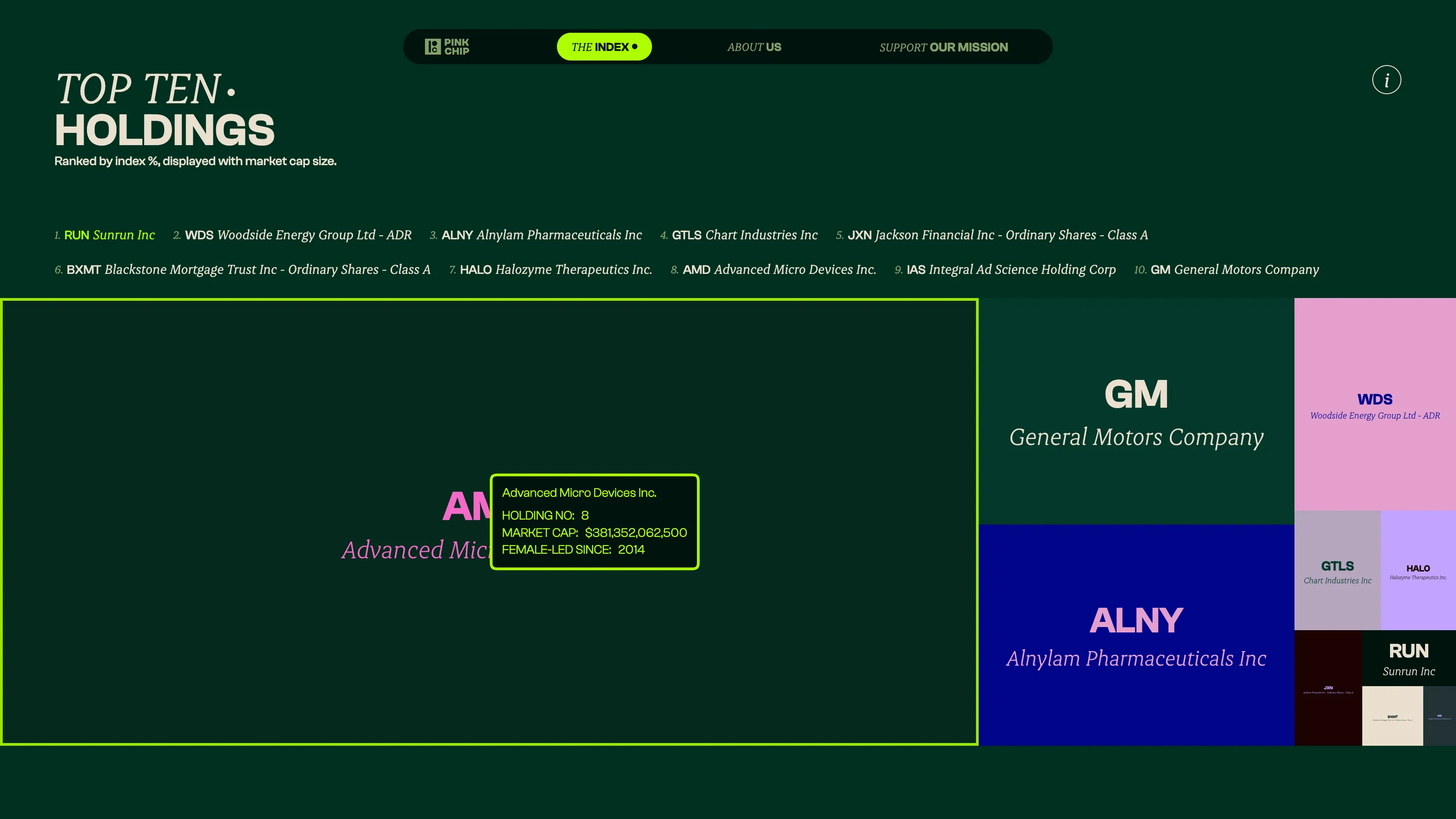
Or Top Ten Hover animations
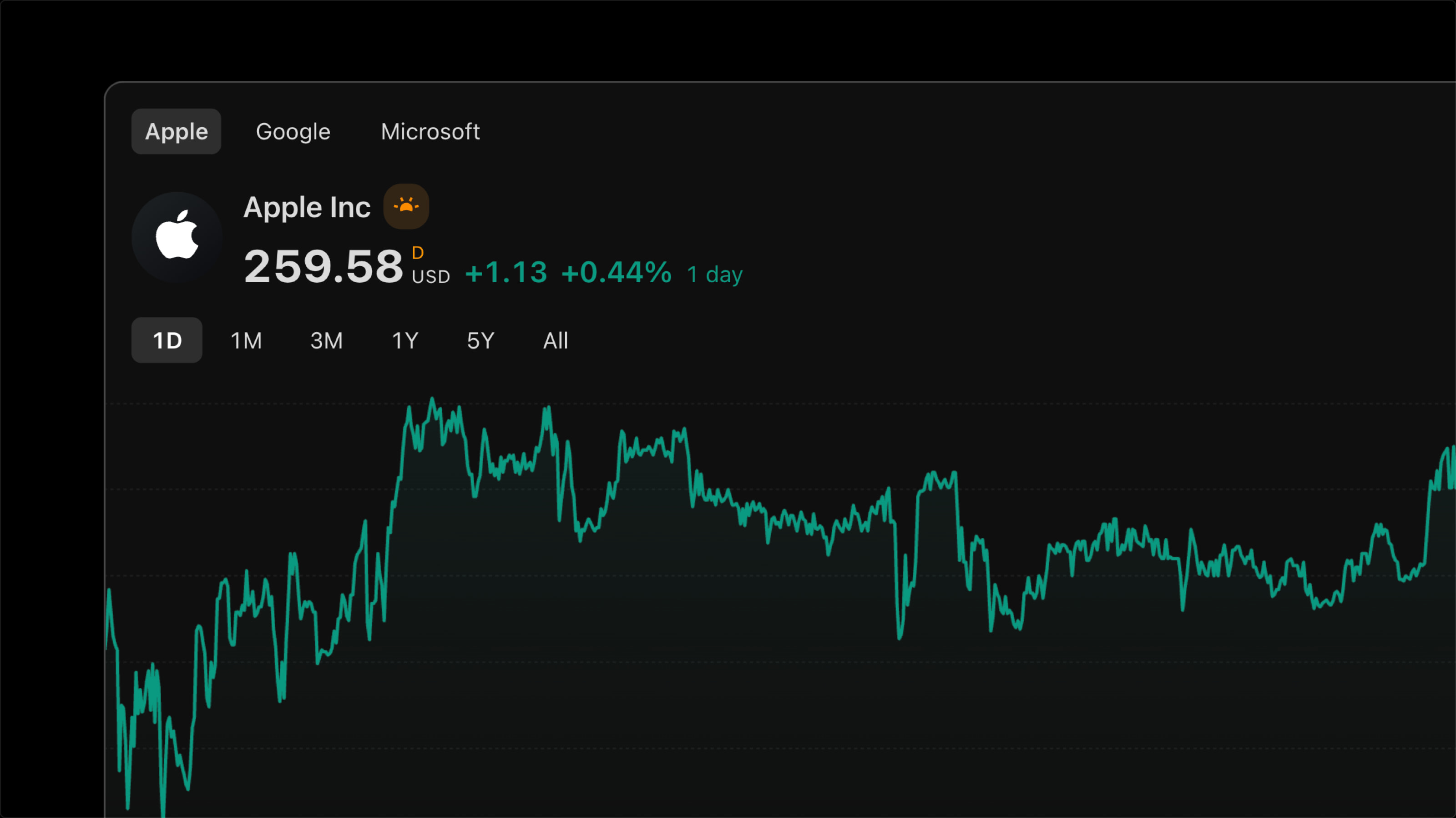
2.3. Dynamic Charts
Dynamic charts are visualizations that change every day, every minute, or even every second.
Examples include live market curves, portfolio tracking, or fund performance monitoring in real time.
{{custom-blog-cta}}
3. How to Integrate Them into Your Website
Depending on the type of chart — static, semi-dynamic, or dynamic — the integration methods vary, each with its own advantages and limitations.
Option 1 – Static Version (simple and controlled)
Usually integrated through an image, video, or HTML table.
This option is easy to set up and edit without any technical skills. The downside: it doesn’t update automatically and offers a limited interactive experience.
Option 2 – Semi-Dynamic Version (Chart.js, Highcharts, etc.)
Using interactive JavaScript libraries such as Chart.js or Highcharts is a popular choice.
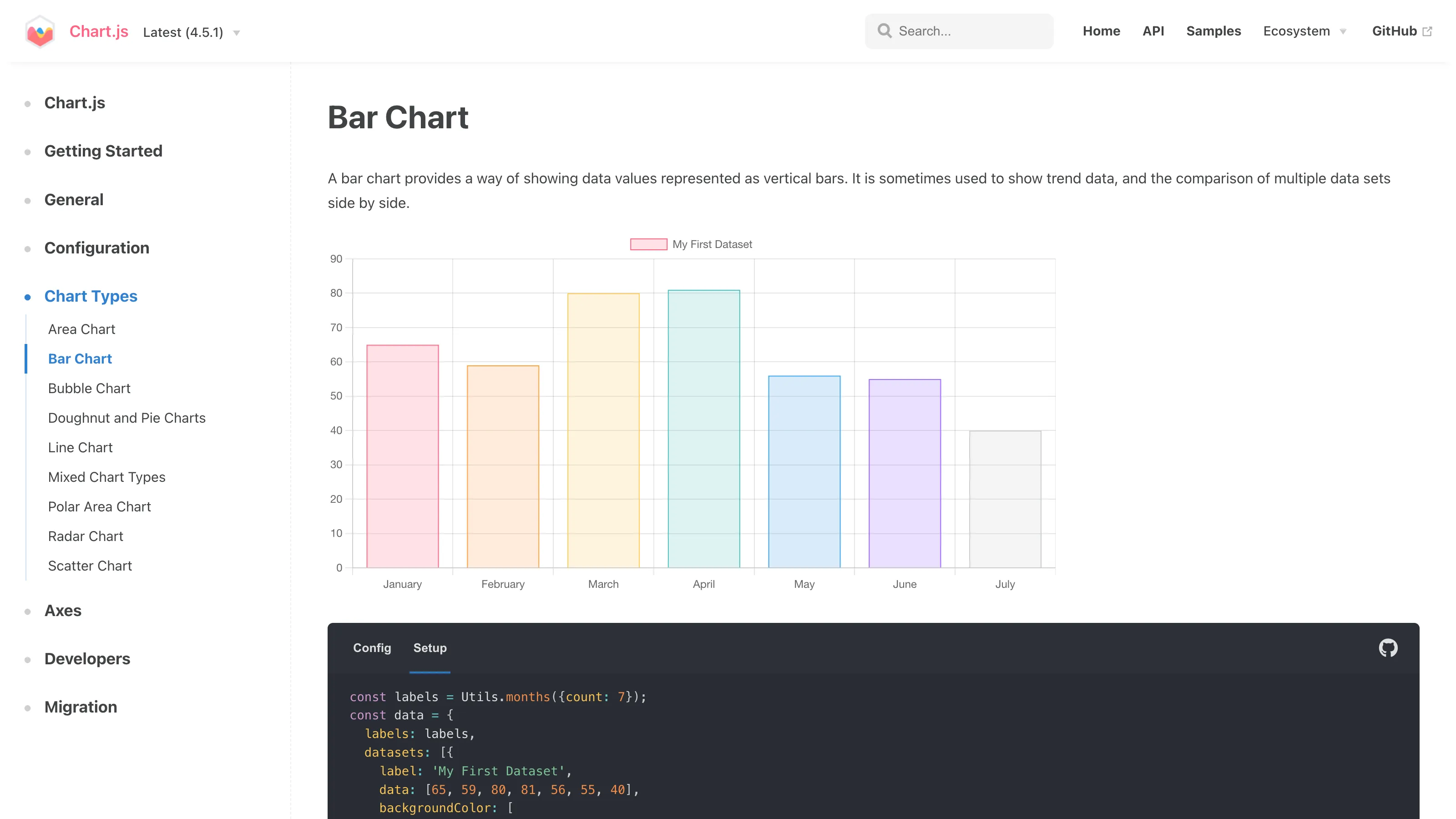
This solution offers a solid balance between aesthetics, performance, and autonomy since these libraries are open-source and relatively easy to handle.
Integration requires some technical knowledge, and maintenance may involve a developer or AI-based assistance.
Option 3 – Dynamic Version (API / Third-Party Tools)
Connect to live data sources such as Quantalys, Finnhub, TradingView, Gothematic, and others.
The main advantage of API or third-party integrations is automation, reliability, and real-time data updates.
However, they can create dependencies on external tools, often come with a cost, and require a more complex technical setup.
Option 4 – With Webflow Code Component (React)
Webflow Code Component allows the creation of a custom React component that can be injected directly into Webflow, making it easy to install on different sites. This approach enables developers to define props, manage slots, and treat the component as a fully reusable entity within the Webflow canvas. (help.webflow.com)
For more information on creating components with Webflow Code Component and Claude Code, check out the live session here:
Conclusion
Whether it’s to illustrate your results or your promises, it’s impossible to talk about finance without talking about numbers. There are different ways to integrate them into your website (Chart.js, APIs, live data), each with its own pros and cons—but all essential to improving conversion on financial sites.
At Digidop, we can guide you in choosing and implementing the right solutions.
Or, if you’d prefer to explore on your own, here are three related articles you might find helpful:
- Discover the 10 most popular tools for chart integrations (Coming soon, subscribe to our newsletter so you don’t miss it!)
- Learn more about the different types of financial charts
- Watch a demo of Chart.js integration on a Webflow project


.jpg)

.jpg)
