Finance has long spoken a “cold” language: static interfaces, emotionless visuals, highly institutional messaging — all designed to inspire trust. But often disconnected from the user’s reality.
Then fintechs and crypto arrived, bringing bold new codes: vibrant colors, casual tone, 3D visuals, more youthful digital experiences. Sometimes a bit too out there — to the detriment of user trust.
So naturally, the question arises: What will tomorrow’s financial design look like?
After numerous conversations with our clients and project work with industry players, we’re seeing clear trends emerge for the year ahead. This article breaks them down.
2026 Market Context
The financial sector has been undergoing a major transformation for several years.
In Europe, over 70% of people manage their finances online — including 25 million in France. At the same time, hundreds of physical bank branches are closing every year. It’s fertile ground for neo-banks. And needless to say, the rise of AI has only accelerated the shift.
This acceleration is forcing the entire market to redefine the concept of trust.
Where trust once meant a physical advisor sitting behind a desk, meeting face-to-face each month — today, it must be built online. Sometimes with the website as the only point of contact.
Companies must now rely on new levers to reassure users: smooth journeys, clear and transparent information, trust-building design, a sense of security, and more.
2026 Design Trends
1. Humanization & Proximity
In 2026, users — behind their screens — want to know who they’re entrusting their money to, and feel there are real people behind the interface.
And financial players are getting the message.
“It takes less than a tenth of a second for a user to form an opinion of your site.” — Julie Delessalle, Brand & Content Manager @Ramify
Performance stats or brand reputation alone are no longer enough. Users seek clarity and proximity.
In terms of design, that means: real photos, conversational tone, team- or founder-signed messages, readable charts, clear data displays, etc.
Firms want to appear accessible — without losing credibility.
Concrete examples:
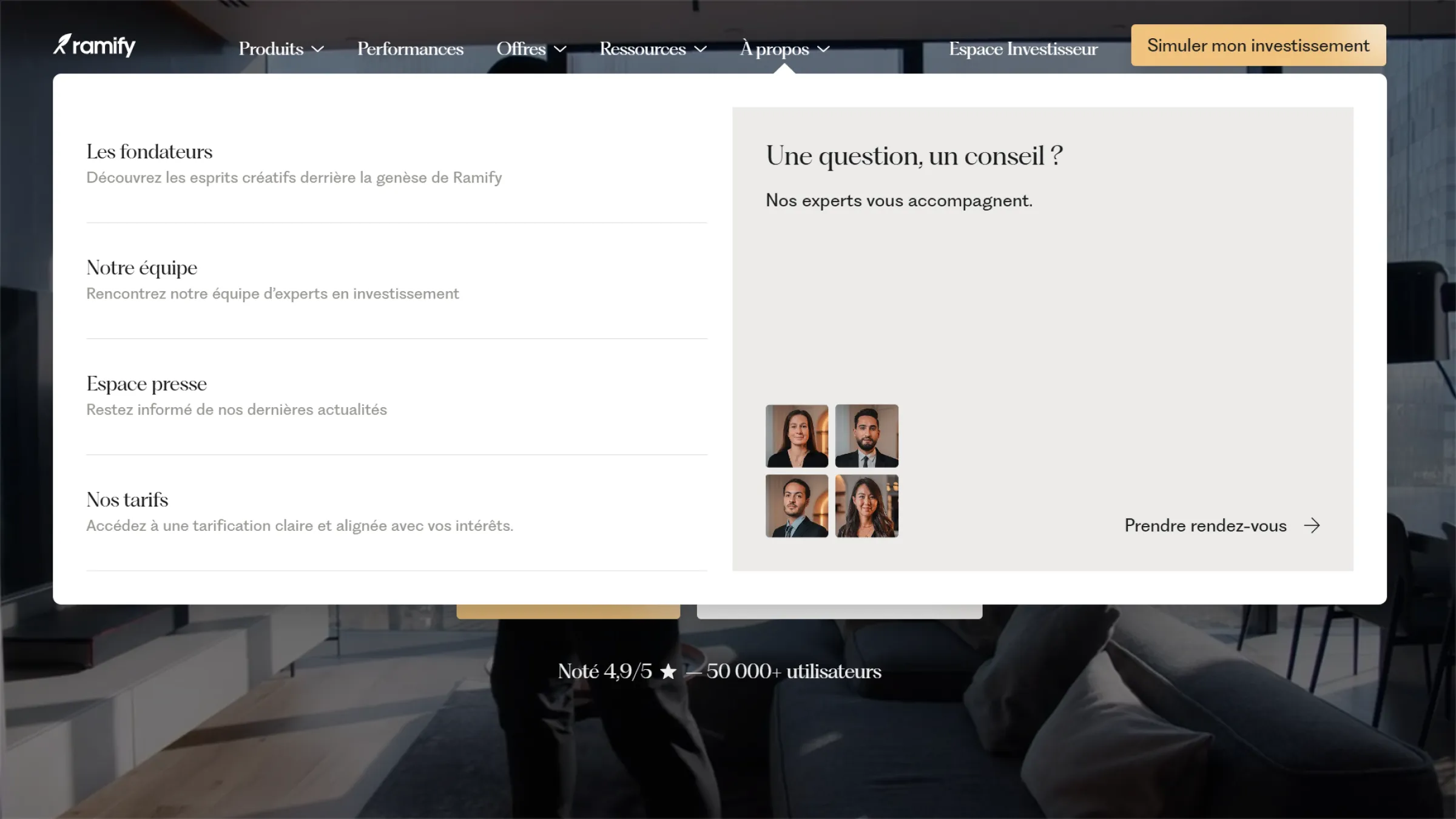
Ramify
→ Founder intro video & vision

→ “Micro-humanization” in the nav bar
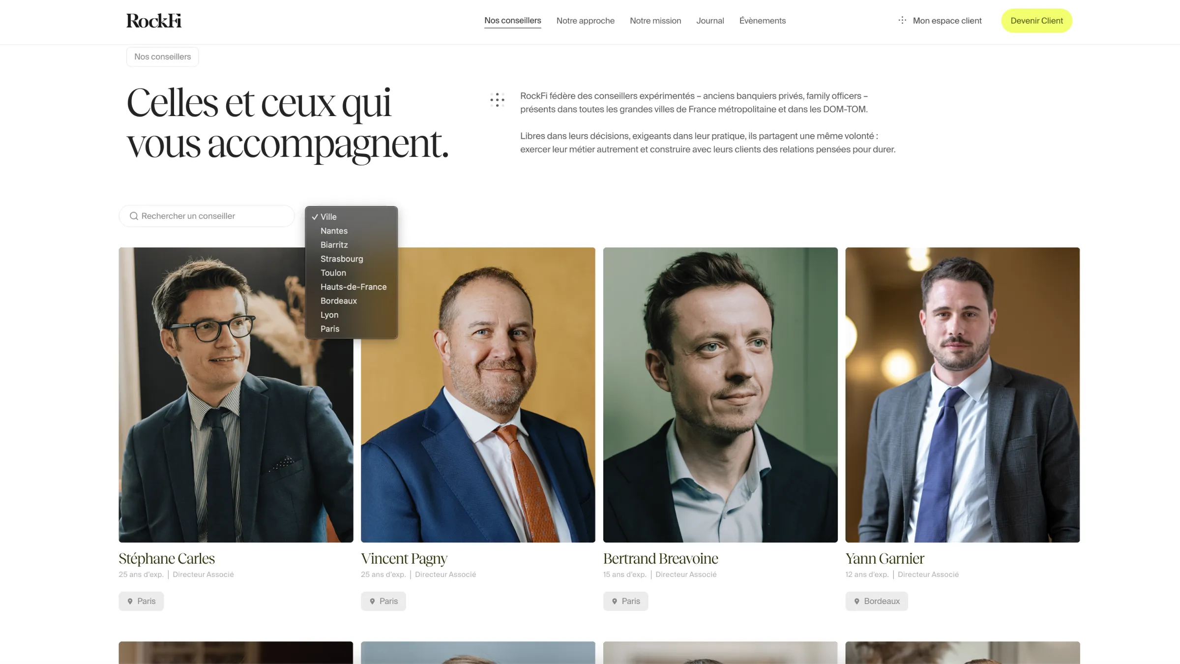
RockFi
→ City-based advisor pages
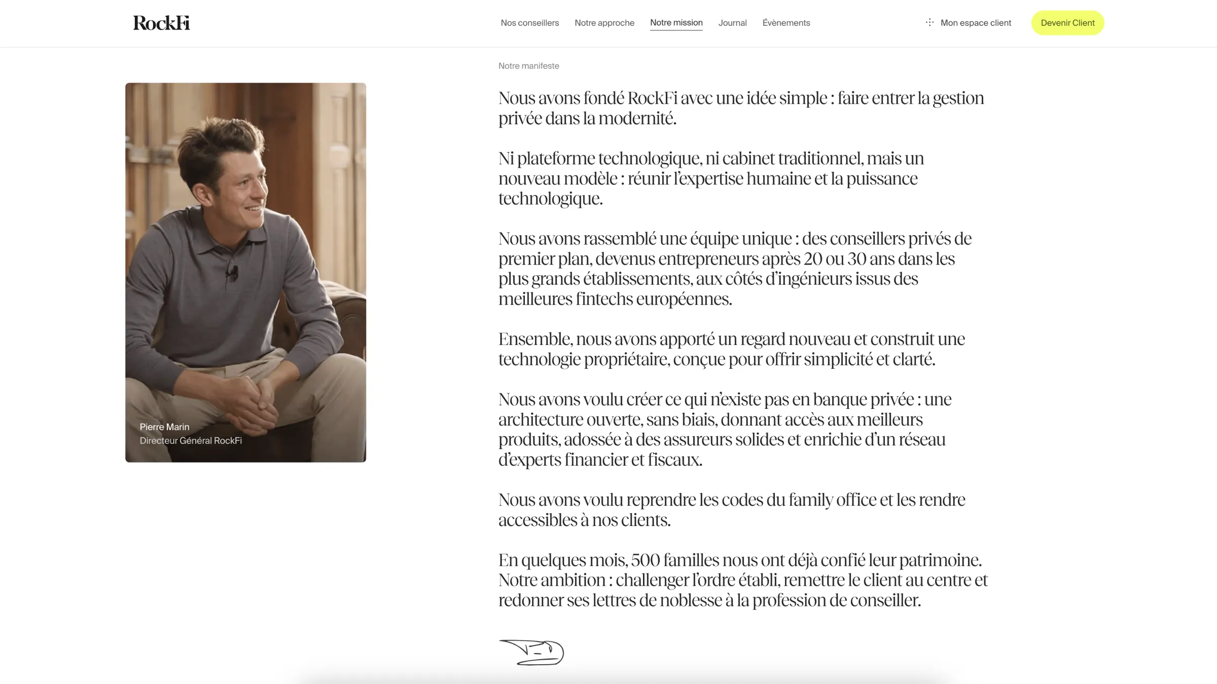
→ Manifesto signed by the CEO
Wealthsimple
→ Humanized visuals tied to financial performance

2. Transparency & Performance
In this industry, trust is fragile. That’s why transparency has become a strategic pillar — and it must be reflected in the design. Users don’t want to guess where their money is going, what hidden fees exist, or what they can expect to earn. They want financial providers to lay it all out.
In 2026, finance websites are becoming clearer, more visual, more explicit — where every design element explains, not just decorates.
Think: direct figures, clear charts, simplified tables, dedicated sections highlighting past performance, etc.
Concrete examples:
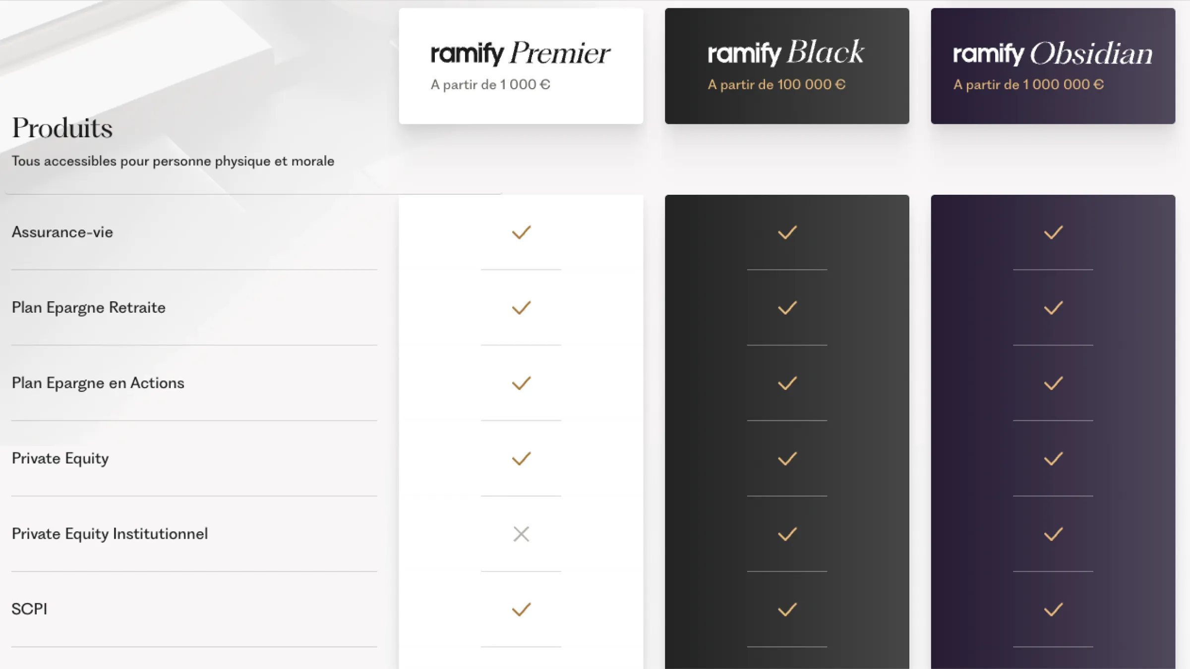
Ramify
→ Detailed offer comparison tables
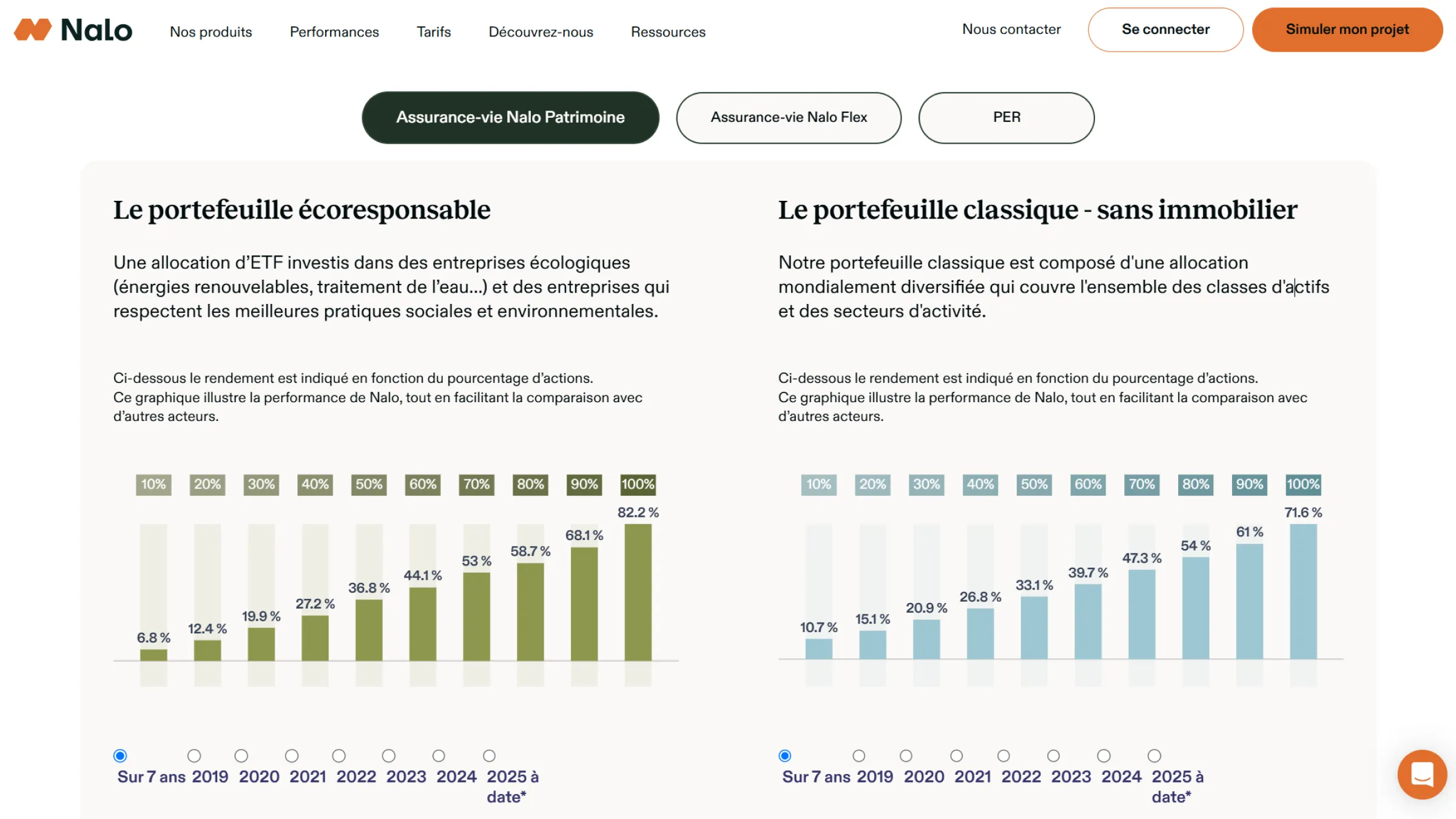
Nalo
→ Static 7-year portfolio performance charts
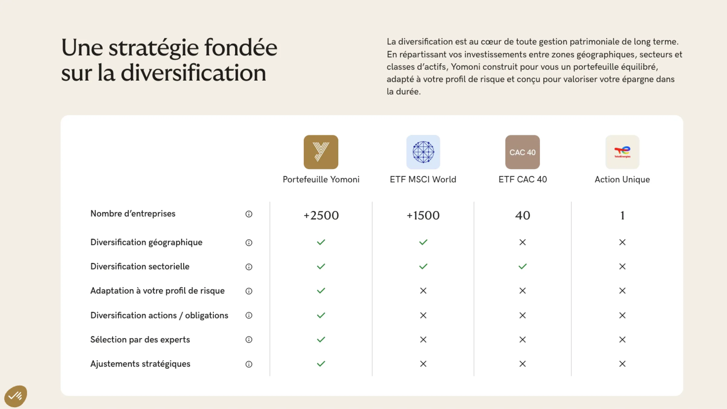
Yomoni
→ Investment diversification strategy visuals
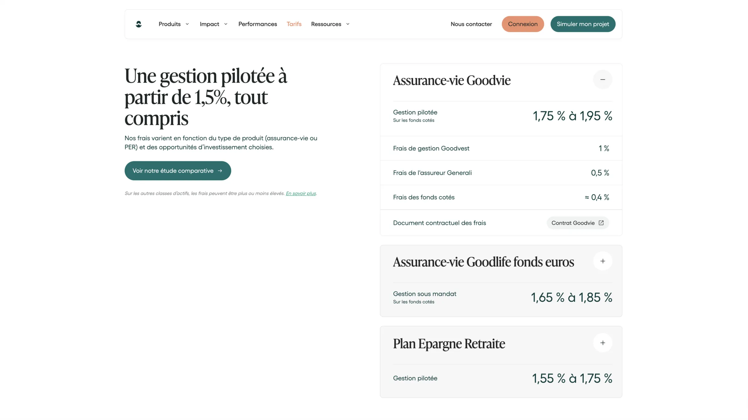
Goodvest
→ Product-specific pricing breakdowns
Pink Chip
→ Dynamic charts for financial index performance
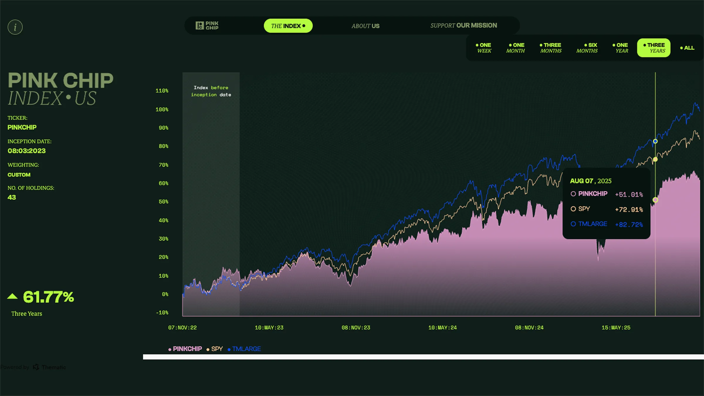
Valhyr Capital
→ Detailed fund composition breakdown

3. Reassurance & Simplicity
Trust must be felt throughout the online experience. And in finance, every detail matters. In 2026, brands are betting on visual coherence and credibility to build trust.
It starts with an intentional art direction: sober colors, readable typography, a clean and consistent design system throughout the site. We’re seeing a shift away from flashy “fintech startup” aesthetics toward something more mature, calm, and reassuring — while staying modern.
Concrete examples:
Qonto
→ Minimal, confident design direction

Ramify
→ Clean visual hierarchy

Reassurance also comes through proof: customer testimonials, reviews, badges, certifications. Once hidden in footers, these elements now appear throughout the core journey.
Concrete examples:
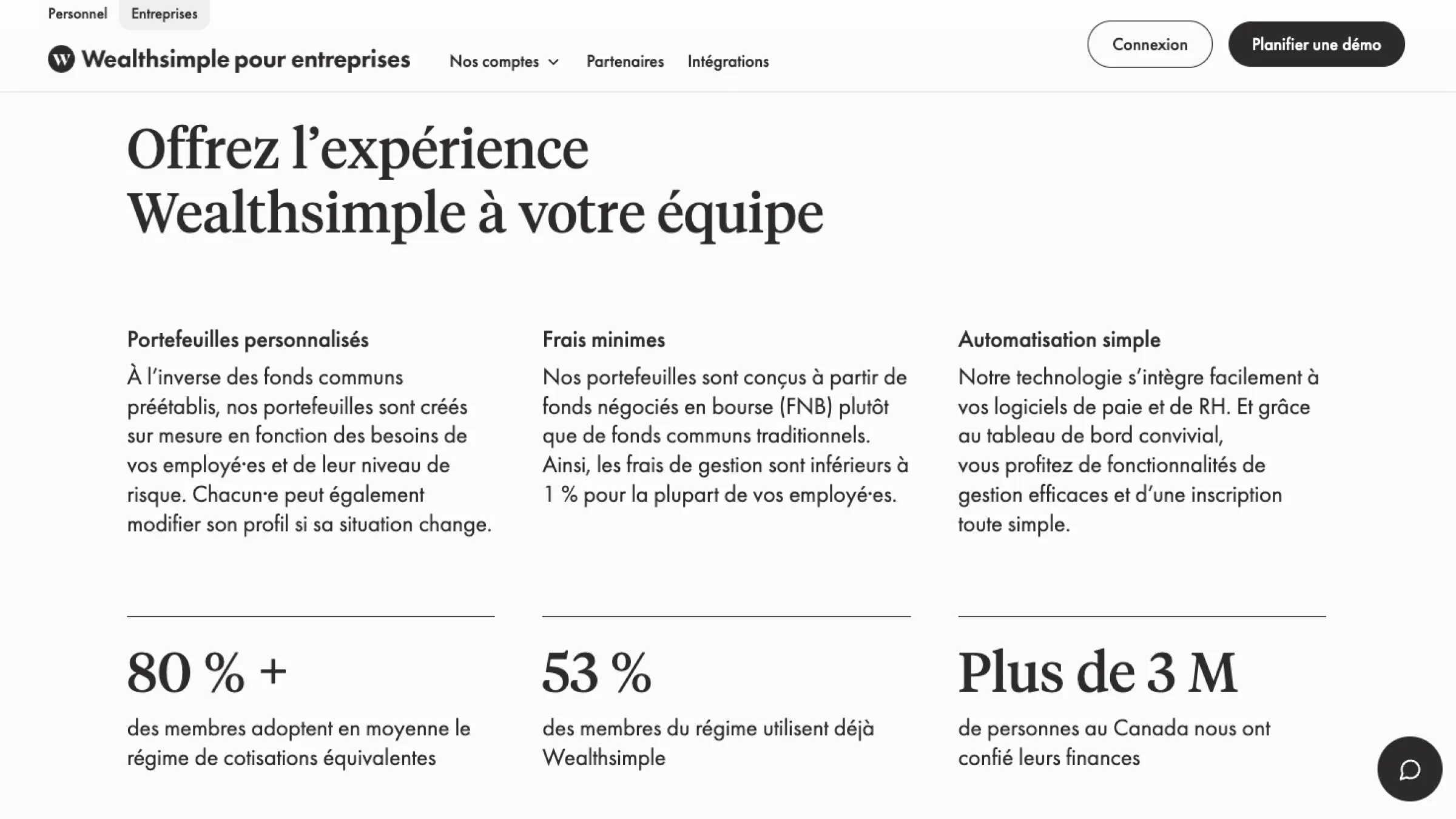
Wealthsimple
→ Key metrics displayed prominently
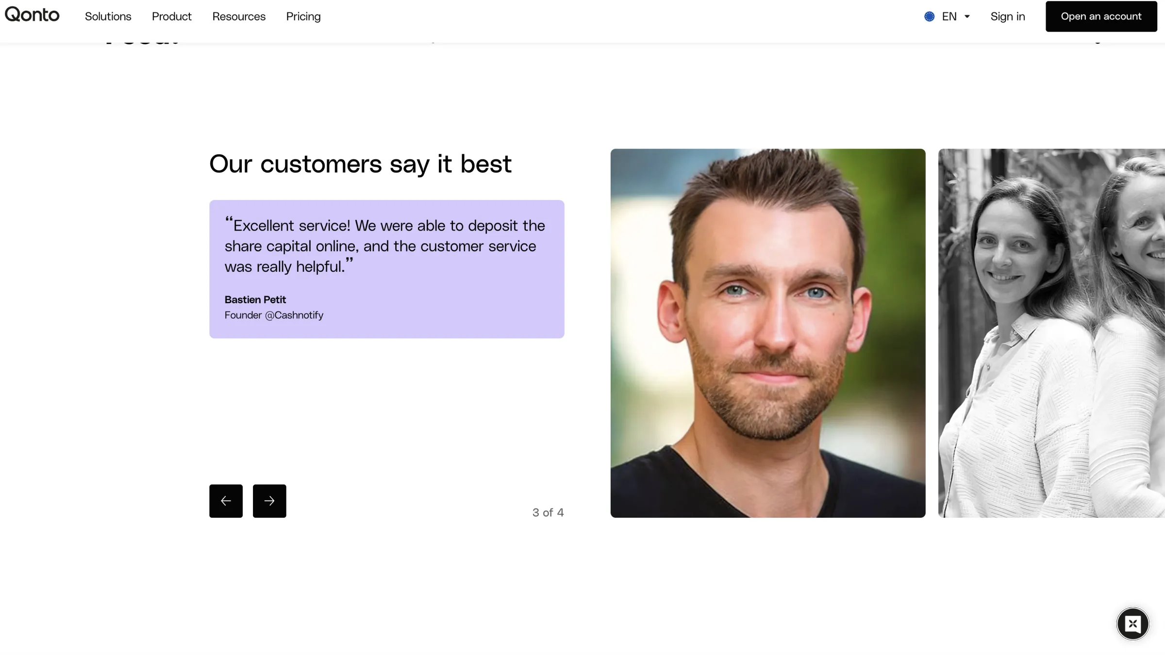
Qonto
→ Customer testimonials integrated early
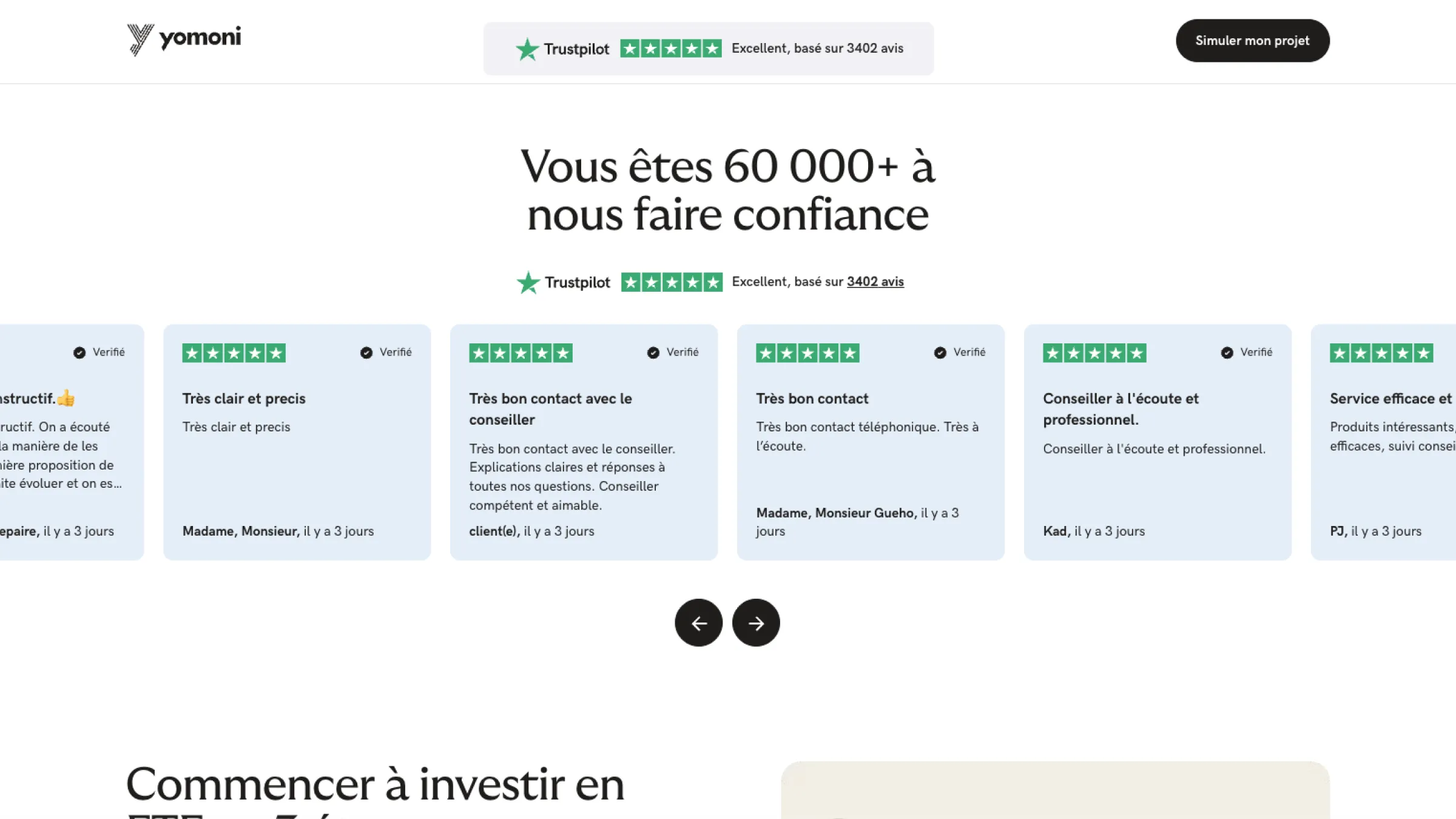
Yomoni
→ Verified customer reviews
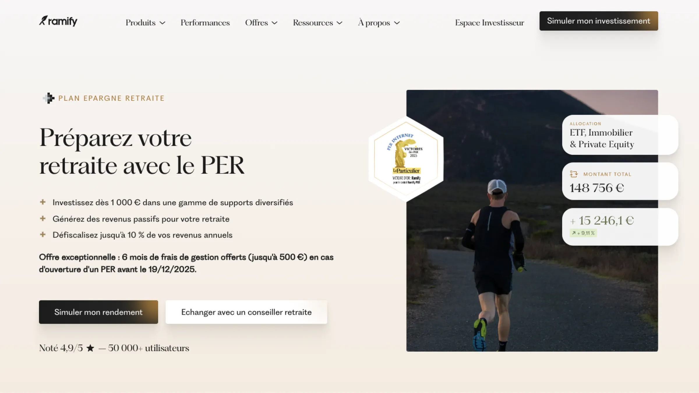
Ramify
→ “Best Retirement Plan 2025” badge
Shine
→ “Voted Best Customer Service 2025” award

4. Security & Compliance
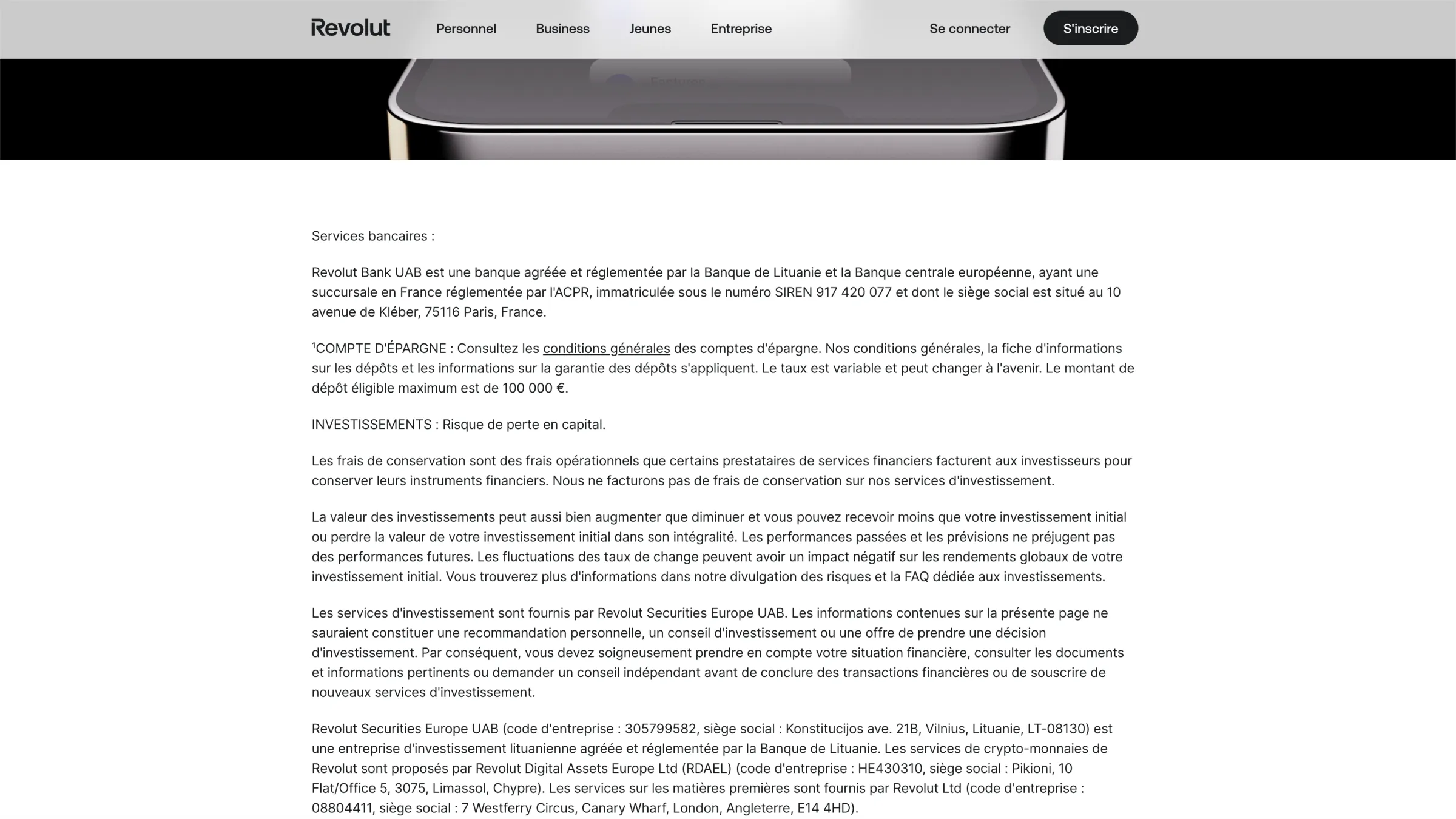
Unsurprisingly, security and compliance remain critical in finance. But where they were once hidden or reserved for regulators, they’re now fully visible — and used as trust-building design elements.
This includes accreditations (AMF, ACPR, FSMA…), encryption protocols, and clear explanations of data handling — all surfaced visually and pedagogically.
Users want to know: where is my data going? Who’s protecting it? Under which authority?
Concrete examples:
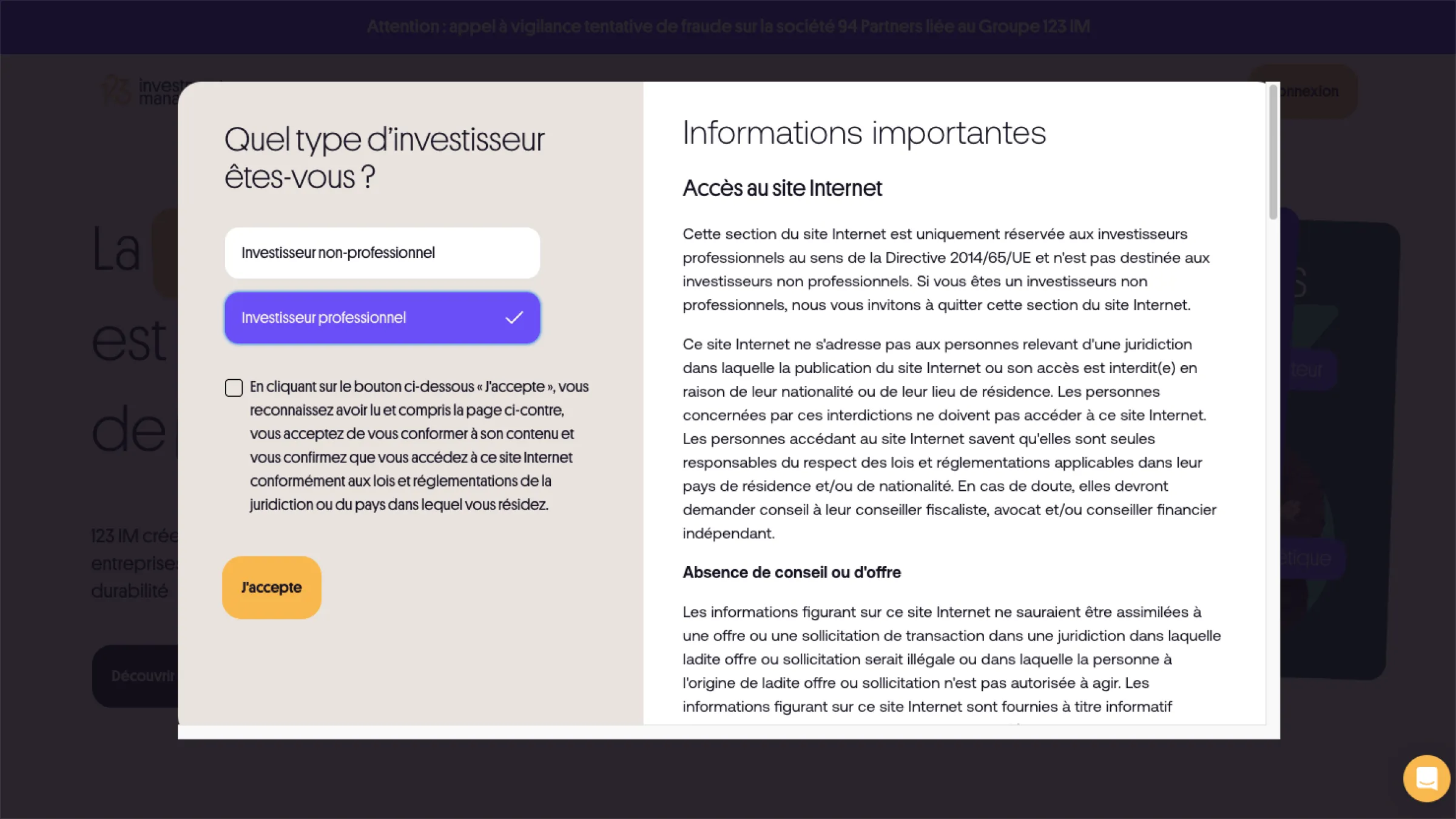
123 Investment Managers
→ Compliance banner for EU Directive 2014/65
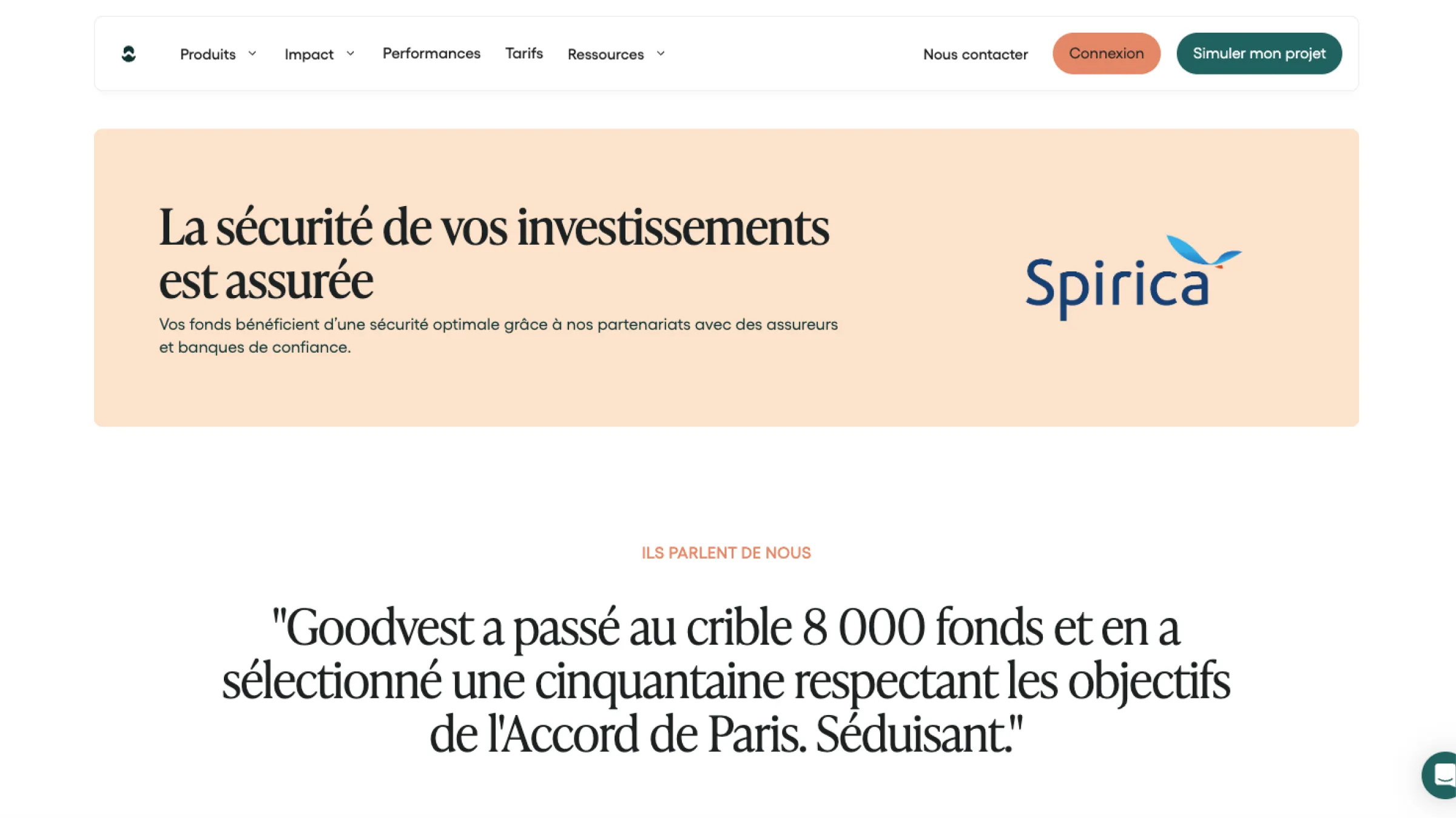
Goodvest
→ Partners (insurance & banking) prominently featured
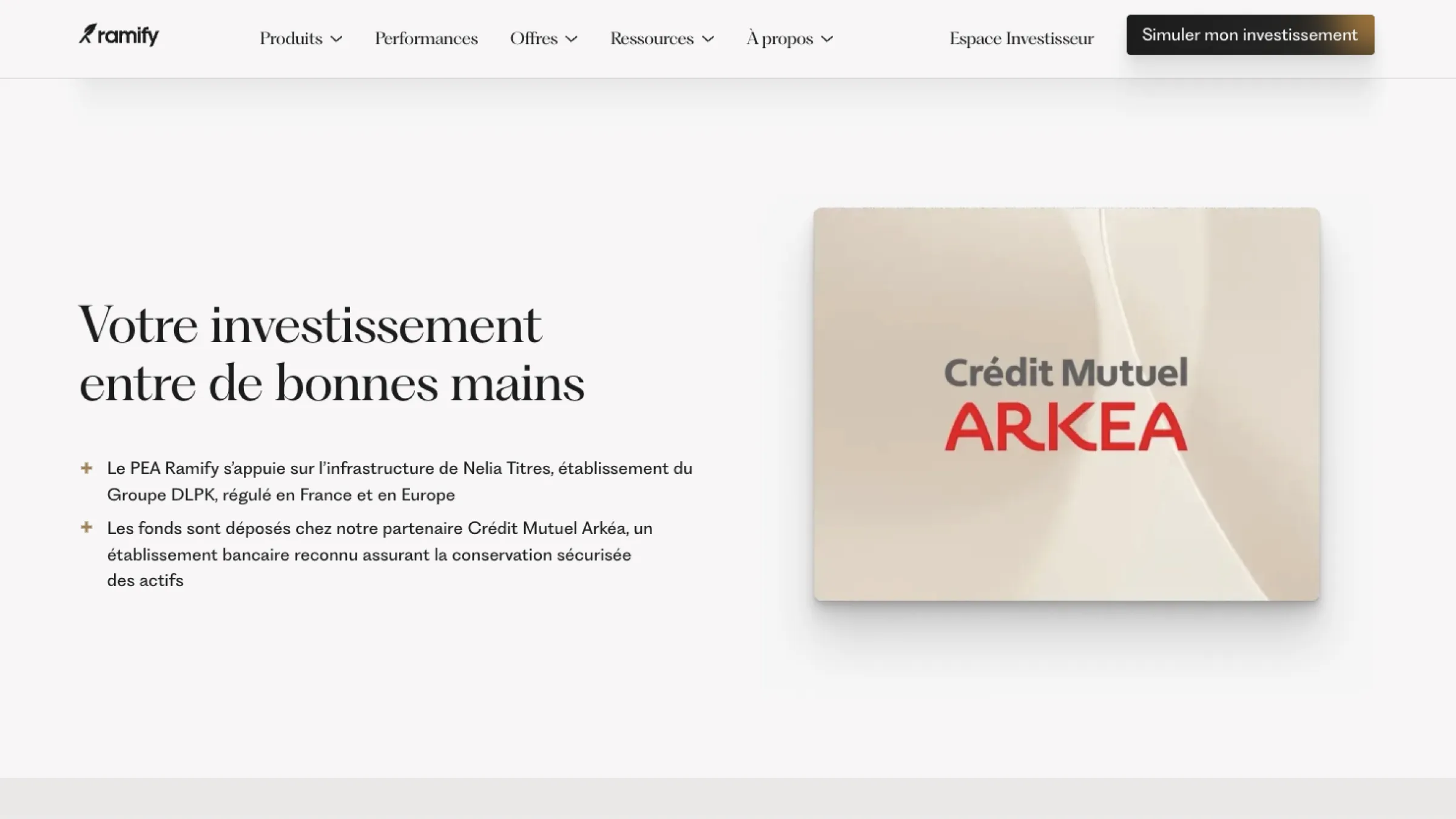
Ramify
→ Full transparency on fund deposit logic
Revolut
→ Banking disclaimer directly in the user flow
5. Experience & Interactivity
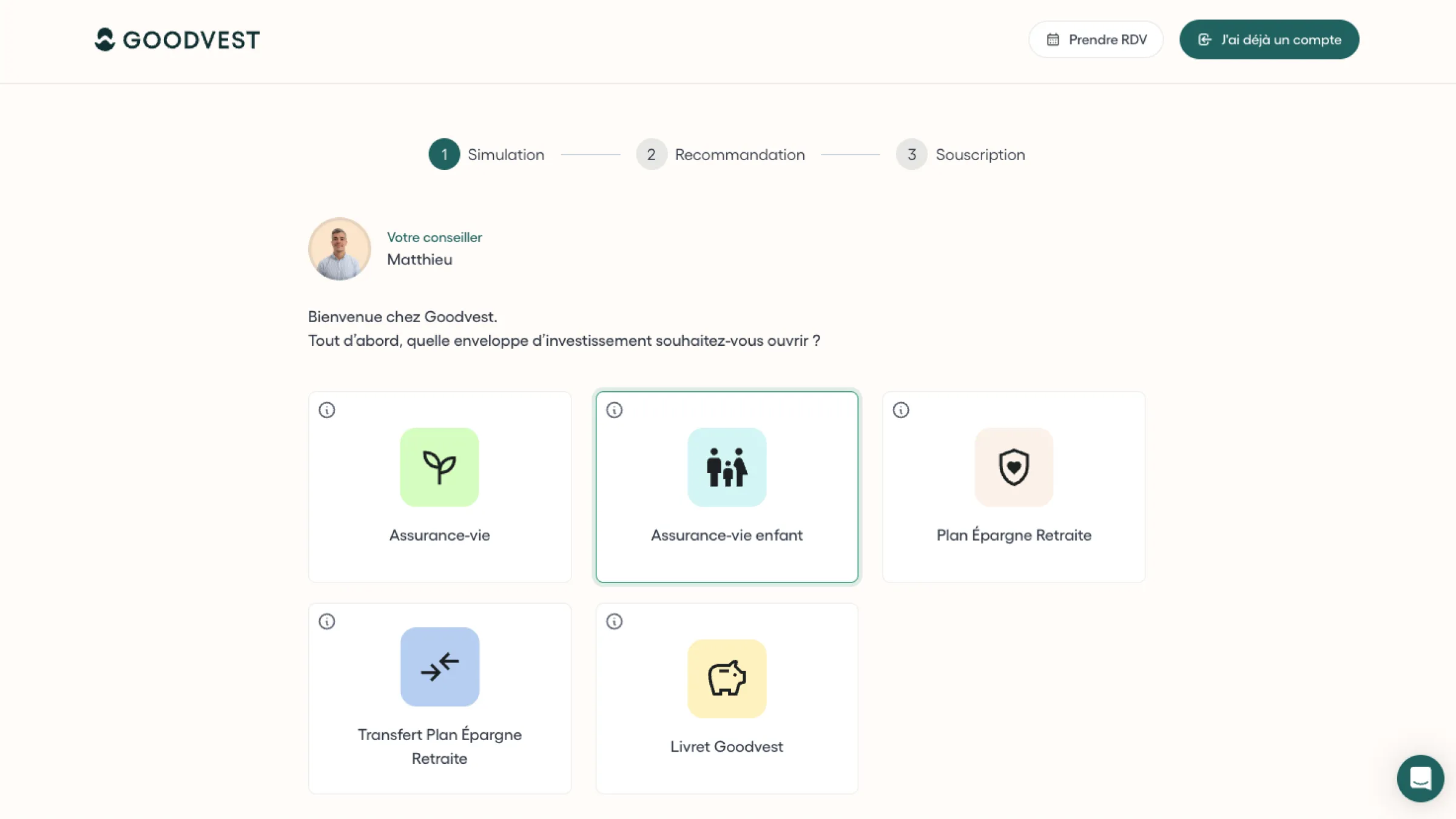
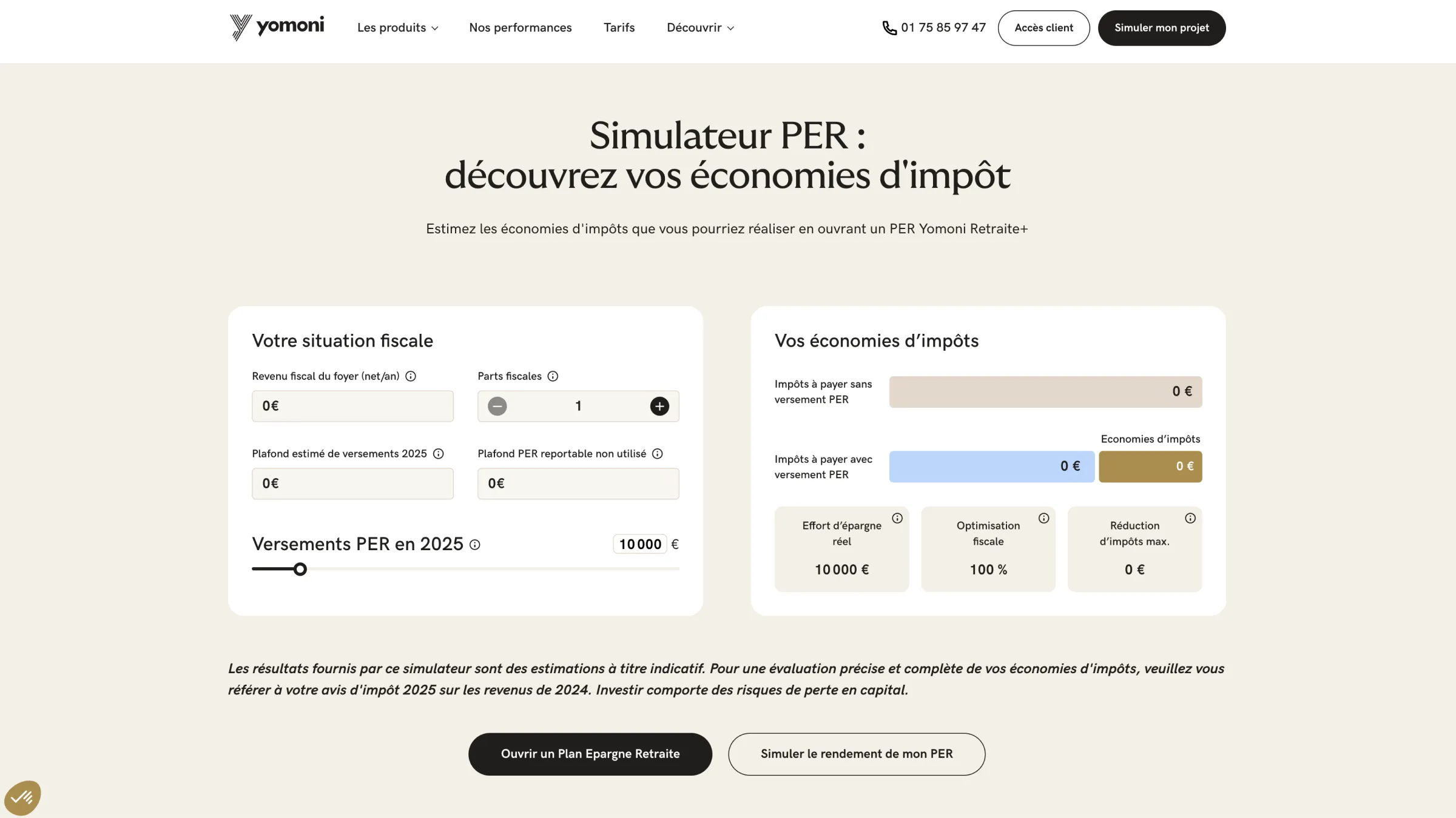
Simulators, calculators, investment quizzes, platform previews — brands are now focused on driving action. The goal isn’t just retention — it’s conversion.
Design is used to make the value proposition tangible, to help users imagine the real experience, and take the next step.
Concrete examples:
Goodvest
→ Project simulation
Ramify
→ Investment strategy simulator

Yomoni
→ Retirement plan (PER) simulator
Breaking the Mold in Finance
While many trends are converging, some brands are pushing boundaries.
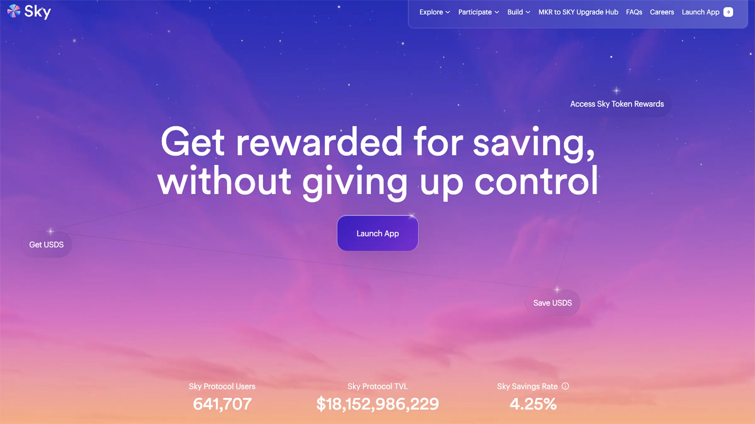
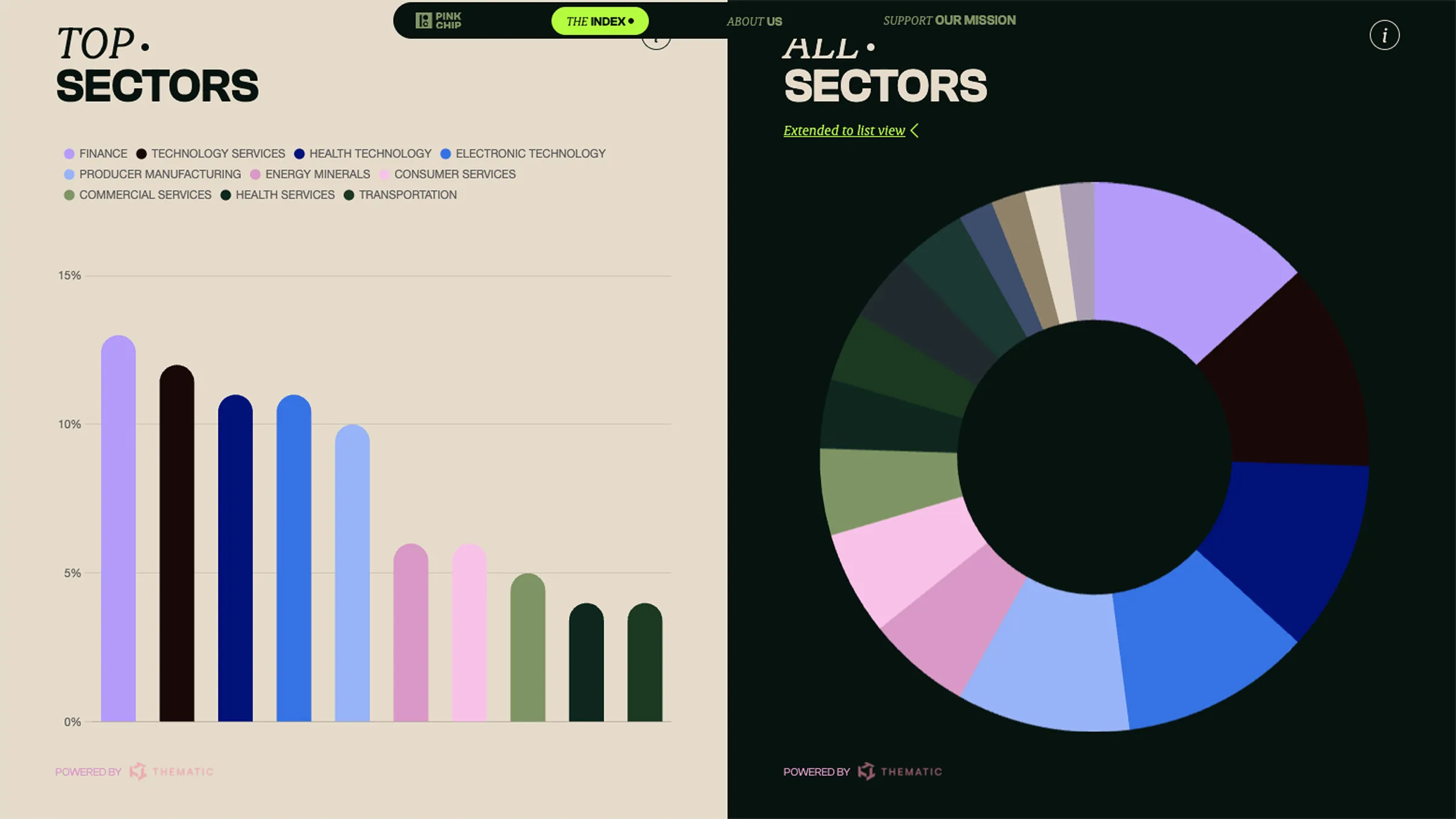
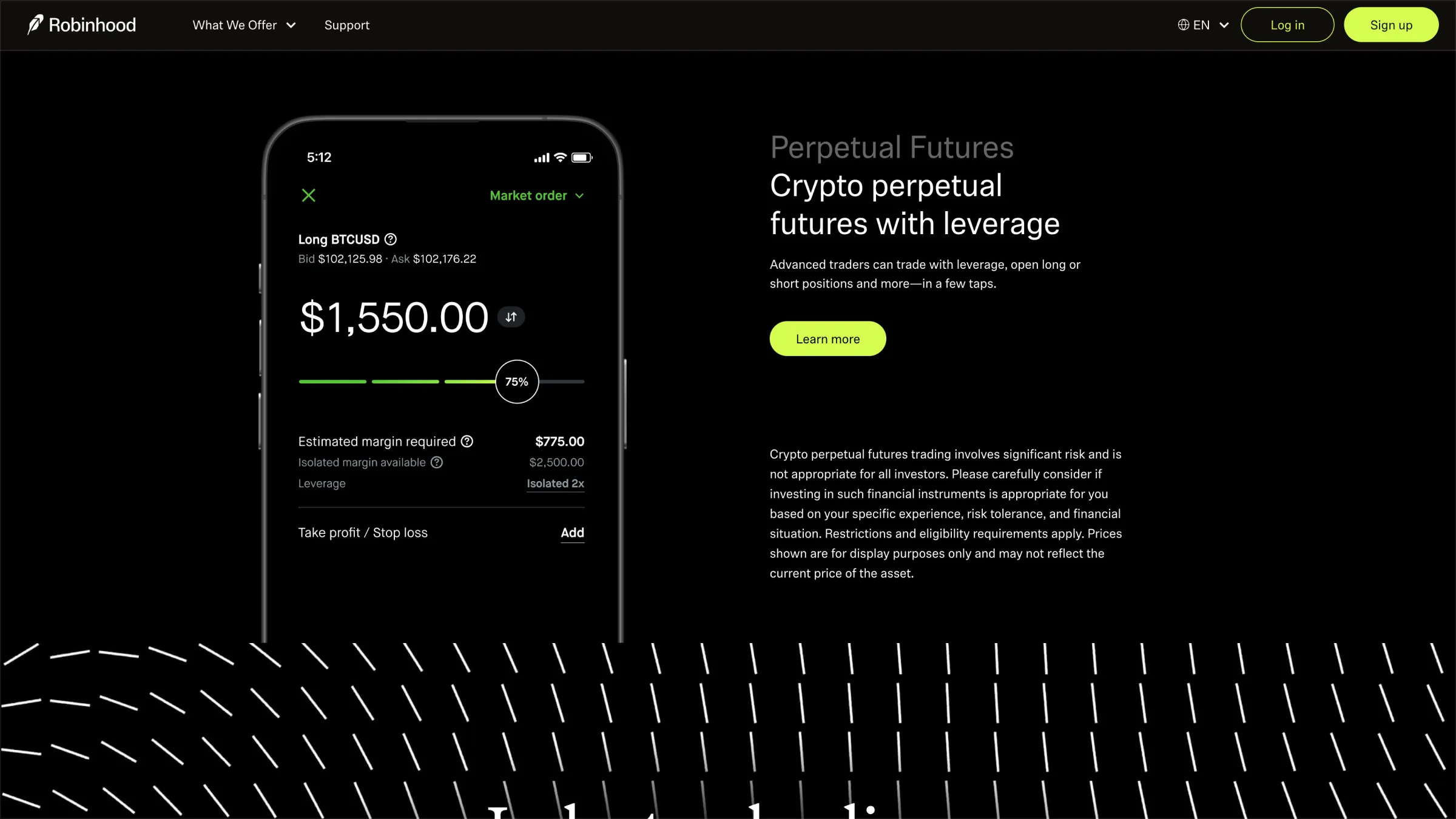
They’re experimenting with bold colors, unconventional typography, immersive experiences — challenging the institutional norms of finance.
Gradients, custom illustrations, 3D elements, micro-animations — design is pushed to the limit to stand out, without losing credibility.
Examples:
Sky
Pink Chip
Wise

Robinhood
Tuyo

Finding the Balance
In finance, balance is everything. A slightly too-bright color, a clumsy 3D graphic, or too many animations can be enough to create doubt — and cost trust.
Building a brand that inspires trust takes time, especially in finance, where certain visual codes still matter. In this era of AI and hyper-digitalization, the focus in 2026 will be on trust and loyalty.
So forget the gimmicks. Focus on clarity, consistency, control, and human connection.
Design is becoming a real vector of trust:
→ Showing guarantees
→ Clarifying data
→ Revealing the intent behind every choice
The top-performing sites will be the ones that find the right balance between all these elements.
Additionnal sources uses for this articles



.jpg)
