
Webflow has been revolutionizing website creation for over a decade, enabling the design of professional interfaces without writing a single line of code. With its 3 million active users in 2025 and a market share that has quadrupled since 2021, the platform stands as the reference no-code alternative.
The fundamental difference between beginners and experts in Webflow? Beginners think mainly "how does this look visually" while experts think "how will this live, evolve, be modified and loaded by the end user". This mindset determines the quality and sustainability of your projects.
1. Not using a framework like Client-First, Lumos or MAST
Developing without a structured methodology is the error that costs the most long-term. Webflow frameworks are not optional for professional projects.
Consequences of chaos:
- Overloaded code with hundreds of redundant classes
- Development time multiplied by 3
- Impossible collaboration between developers
- Nightmarish maintenance
Recommended frameworks in 2025:
Client-First V2 (Finsweet) - The most popular
.button_primary           // Main element
.button_primary-hover     // Hover state
.text-size-large          // Utility class
.padding-section          // Standardized spacing
Lumos (Timothy Ricks) - Alternative moderne
.btn-primary              // Component
.txt-lg                   // Text utility
.space-md                 // Spacing
MAST (nocodesupply)
.component-name           // Simple structure
.utility-class           // Reusable classes
These frameworks guarantee readability, scalability, performance and collaboration between teams.
There are various techniques to improve your website's speed.
2. Developing without mockups or planning
Jumping directly into Webflow without defined architecture leads to costly redesigns and wobbly structures.
Planning errors:
- No wireframes: structure improvised during development
- No UX thinking: confusing navigation, broken user journey
- Non-existent design system: visual inconsistencies everywhere
- Unprepared content: Lorem ipsum until launch
Expert methodology:
- Wireframes: define information architecture
- Style guide: colors, typography, spacing, components
- Functional mockups: interactions and states defined
- Real content: final texts, images, data
- User testing: validation before development
This approach divides development time by 3 and avoids 90% of mid-course modifications.
3. Not starting with a style guide
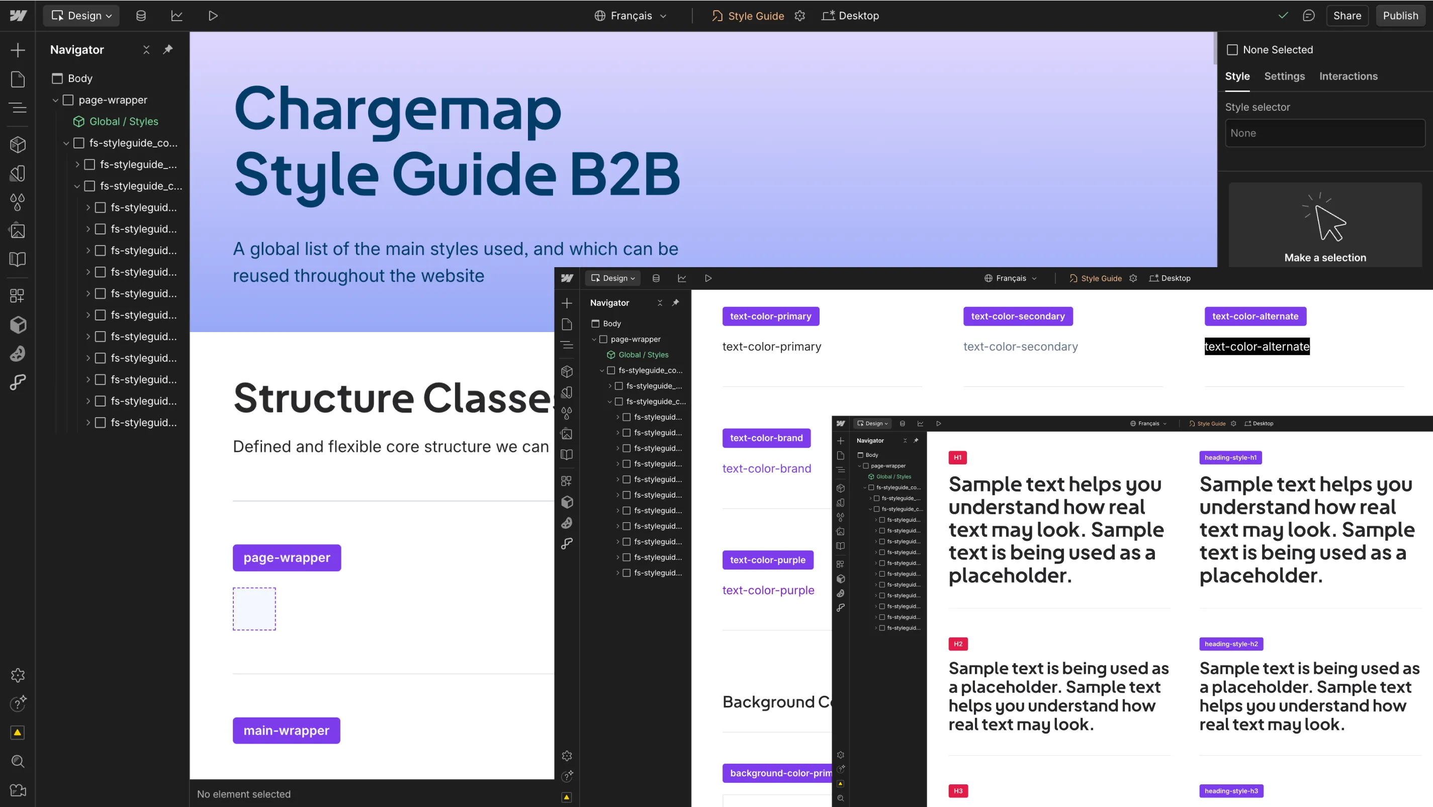
Developing without visual foundations creates inconsistencies impossible to correct later.
Consequences:
- 20 different shades of blue across the site
- Anarchic typography: random sizes and weights
- Chaotic spacing: padding and margins by feeling
- Non-reusable components
Essential style guide:
Color variables:
--color-primary: main brand color--color-secondary: accent color--color-text-body: content text--color-text-muted: secondary text--color-border: borders and separators
Typography system:
--text-size-xs: 0.75rem - annotations--text-size-sm: 0.875rem - labels--text-size-base: 1rem - body text--text-size-lg: 1.25rem - subtitles--text-size-xl: 1.5rem - titles
Consistent spacing:
--space-xs: 0.5rem--space-sm: 1rem--space-md: 1.5rem--space-lg: 3rem--space-xl: 6rem
4. Manually changing font/color on each element
Beginners modify each title individually. Experts create reusable classes that guarantee consistency.
Symptoms of tinkering:
- Modifying 50 titles one by one to change a color
- Visual inconsistencies: same element, different styles
- Impossible maintenance: unable to make global changes
- Bloated code: hundreds of inline styles
Systematic approach:
Typography classes:
.heading-style-h1         // Main title
.heading-style-h2         // Section title
.text-style-body          // Body text
.text-style-caption       // Captions
Utility classes:
.text-color-primary       // Primary color
.text-color-muted         // Secondary text
.text-weight-bold         // Bold
.text-align-center        // Centered
Concrete gain: Modifying one variable instantly impacts the entire site, guaranteeing consistency and maintenance speed.
5. Not using components and variables
Webflow 2025 offers native components and a powerful variable system. Not using them is like developing with tied hands.
Webflow 2025 variables:
- Colors: instant global modifications
- Spacing: consistent system across the entire site
- Typography: standardized sizes and weights
- Breakpoints: automatic responsive
Reusable components:
- Buttons: variants (primary, secondary, ghost, disabled)
- Cards: flexible structure with slots for title, content, actions
- Navigation: active, hover, mobile states
- Forms: validation and consistent styles
Concrete example:Instead of creating 10 different buttons, create 1 component with variants. Modifying the main style updates 50 instances across the site with one click.
6. Multiplying unnecessary containers
Beginner: 8 nested divs to position one element.
Expert: simple and logical structure with modern CSS.
Acute divitis:
<div class="container">
  <div class="wrapper">
    <div class="inner">
      <div class="content">
        <div class="text-holder">
          <div class="title-wrap">
            <h2>My title</h2>
Clean structure:
<section class="hero-section">
  <div class="container">
    <h2 class="hero-title">Mon titre</h2>
Advantages:
- Lightweight code: less DOM, faster
- Simple maintenance: understandable structure
- Accessibility: fluid keyboard navigation
- Optimized SEO: logical HTML hierarchy
7. Reproducing "pixel perfect" design without logic
Figma copy-paste trap: reproducing visually without thinking about technical and functional structure.
Beginner errors:
- 20+ divs to recreate a simple layout
- Absolute positioning everywhere to "stick" to the design
- Fixed sizes that break on mobile
- No responsive logic
Expert approach:
- Analyze the logic: what does this section do?
- Simplify the structure: fewer elements, more efficiency
- Think responsive first: mobile → desktop
- Use semantics: <!-- fs-richtext-ignore -->
<header>,<section>,<article>
Concrete example: Figma design with 12 layers for a card → HTML solution: 1 <!-- fs-richtext-ignore --> <article> with Flexbox.
8. Using fixed sizes everywhere
320px, 1200px, 24px: fixed values break adaptability and accessibility.
Problems with fixed pixels:
- Browser zoom: content cut off at 125%
- Variable screens: overflow on small resolutions
- Accessibility: doesn't respect user preferences
Modern relative units:
- rem: based on root font size (16px default)
- em: relative to parent element
- vw/vh: viewport percentage
- %: relative to parent container
- clamp(): adaptive values with min/max
Practical examples:
/* ❌ Fixed */
font-size: 24px;
width: 1200px;
padding: 20px;

/* ✅ Adaptive */
font-size: 1.5rem;
max-width: 75rem;
padding: clamp(1rem, 4vw, 3rem);
9. Building a non-scalable site
Creating a blog without CMS or static product pages condemns your client to depend on you for every modification.
Scalability errors:
- Static pages for repetitive content
- No CMS for articles, team, testimonials
- Rigid structure that doesn't support evolution
- Editor mode unusable by the client
Scalable solutions:
Essential CMS collections:
- Blog posts: articles with categories, tags, authors
- Team: members with bio, photo, social networks
- Portfolio: projects with galleries and descriptions
- FAQ: editable questions/answers
- Testimonials: reviews with ratings and photos
Dynamic templates:
- Collection pages that adapt to content
- Conditional visibility based on fields
- Rich text for client formatting
- Multi-reference for relationships
10. Abusing "quick fixes"
Using absolute positioning, negative margins and anarchic z-index to "fix" structural problems.
Toxic quick fixes:
position: absoluteto reposition poorly placed elementsmargin-top: -150pxto bring sections closerz-index: 999999to make an element appear in frontoverflow: hiddento hide overflows- Custom CSS with
!importantto force styles
Golden rule: If you use custom CSS to "fix", it means the HTML structure is poorly thought out.
Clean solutions:
- Flexbox/Grid for all alignments
- Standardized spacing variables
- Organized z-index: 1-10 (content), 100-200 (navigation), 1000+ (modals)
- Logical structure that avoids corrections
Technical bonus errors
Ignoring SEO and accessibility
SEO and accessibility go hand in hand and are not optional in 2025.
Critical errors:
- Unstructured H1-H6 tags
- Empty meta descriptions
- Images without alt and poorly named
- Insufficient contrasts (minimum 4.5:1)
- Impossible keyboard navigation
Improving your website's accessibility is an important practice for the inclusion of people with disabilities and, secondly, for your SEO.
Forgetting overflow management
Cut-off elements on mobile ruin user experience.
Solutions:
- Test on all breakpoints
- Use
overflow: hiddenconsciously - Favor Flexbox with wrap
- Plan for long content
FAQ
Should you always start with a style guide?
Absolutely. It's like building a house without a plan. The style guide defines your colors, typography and basic spacing, avoiding 80% of inconsistencies and accelerating development.
How to avoid unnecessary containers?
Think logic before visual. Each HTML element must have a functional reason for being. Use Flexbox and Grid for layouts rather than stacking divs.
Which Webflow frameworks to choose in 2025?
Client-First V2 remains the most documented. Lumos is more modern and simple. MAST suits minimalist projects. All are better than no framework.
The mindset that changes everything
Webflow expertise doesn't come from technical mastery, but from mindset change:
Beginner: "How to make this look like Figma?"
Expert: "How to structure this so it lives and evolves?"
This philosophy transforms creators of "showcase sites" into architects of sustainable digital experiences. In 2025, with AI, variables and native components, Webflow becomes a true professional creation studio.
Investing in these best practices isn't a waste of time, it's an investment that will save you weeks of development and guarantee that your creations remain performant and maintainable for years to come.
If you need assistance in creating or developing your Webflow site, we recommend the best Webflow agency in France: Digidop!
Sources and resources
- Client-First V2 Documentation - Reference framework by Finsweet
- Lumos Framework - Modern alternative by Timothy Ricks
- Webflow University - Official training and best practices
.webp)


.jpg)
