In today's Webflow tutorial, we will explore how to restrict the number of items on Tablet or mobile devices, or according to a specific screen size.
Use Case Example for Your Webflow Site
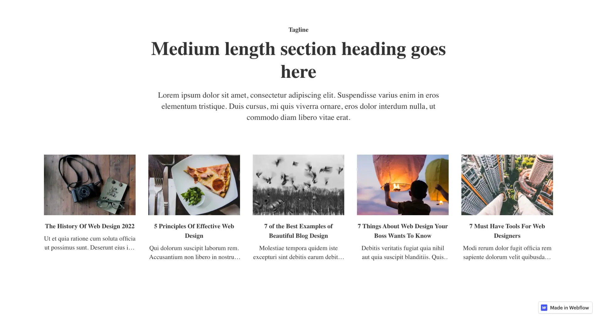
Imagine you have a collection on desktop with a limit of 5 items, and your collection list is displayed in a grid format with 5 columns.
This layout may work perfectly on Desktop, but from the tablet version onwards, your items could become too cramped in this grid.
You might consider switching from columns to rows or using another type of display.
The Different Types of Element Displays in Webflow
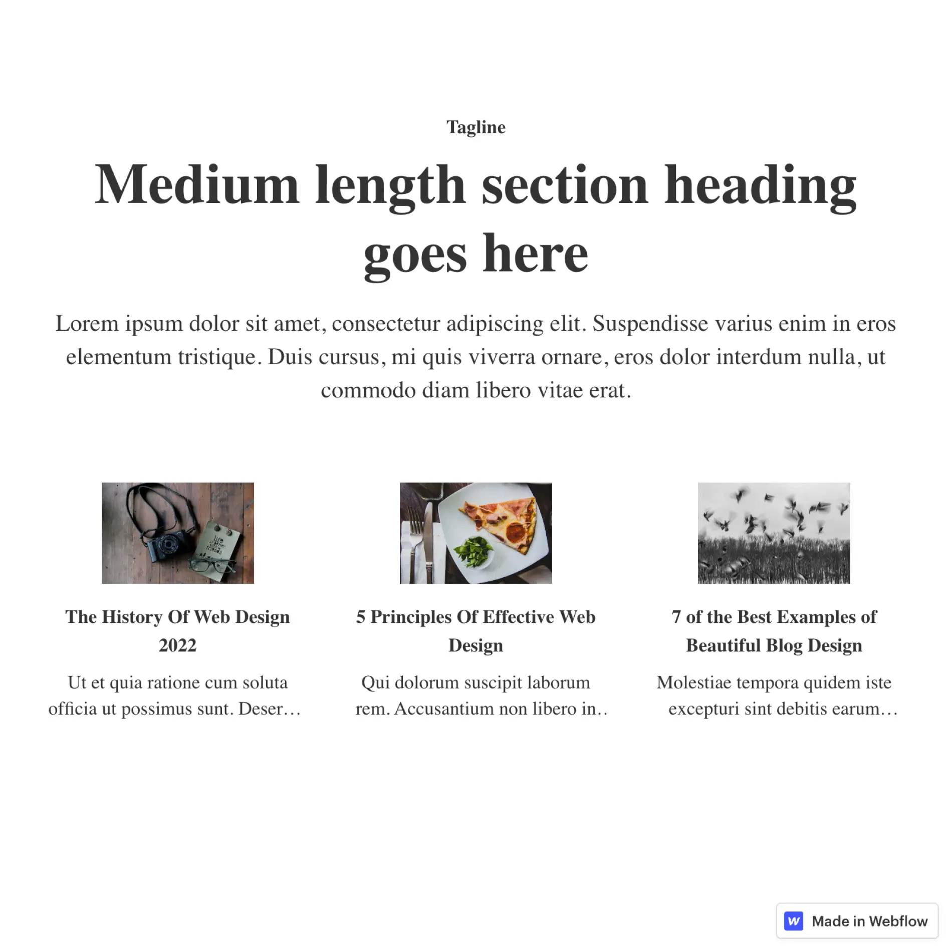
However, this change can impact your design, and you may conclude that 3 items for the tablet version would be an ideal limit.
Tutorial in Webflow
Step 1: Insert a Collection
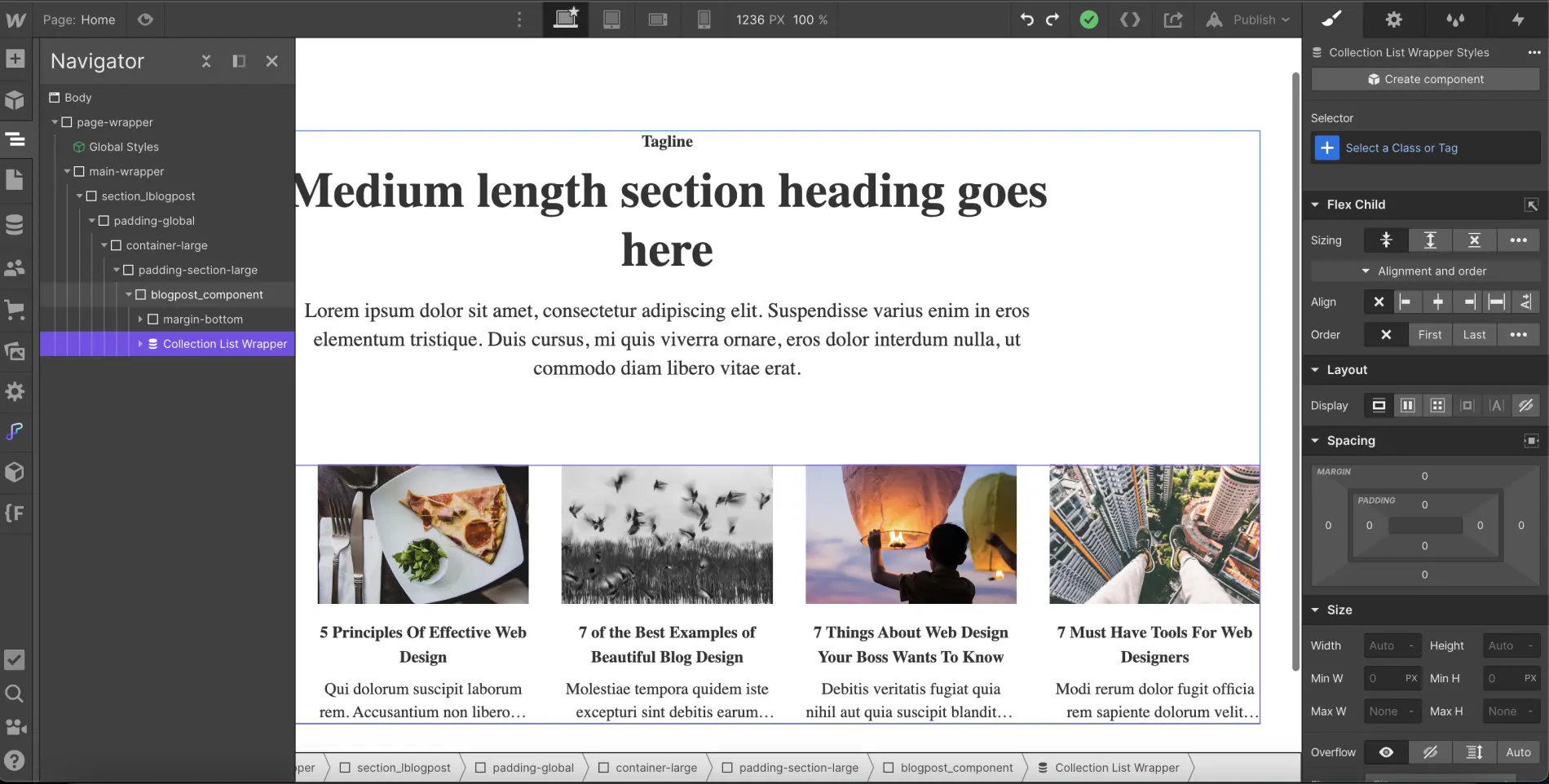
The first step, if not already done, is to add a collection at the desired location on your page. You can then customize it as you see fit.
Step 2: Add an Item Limit
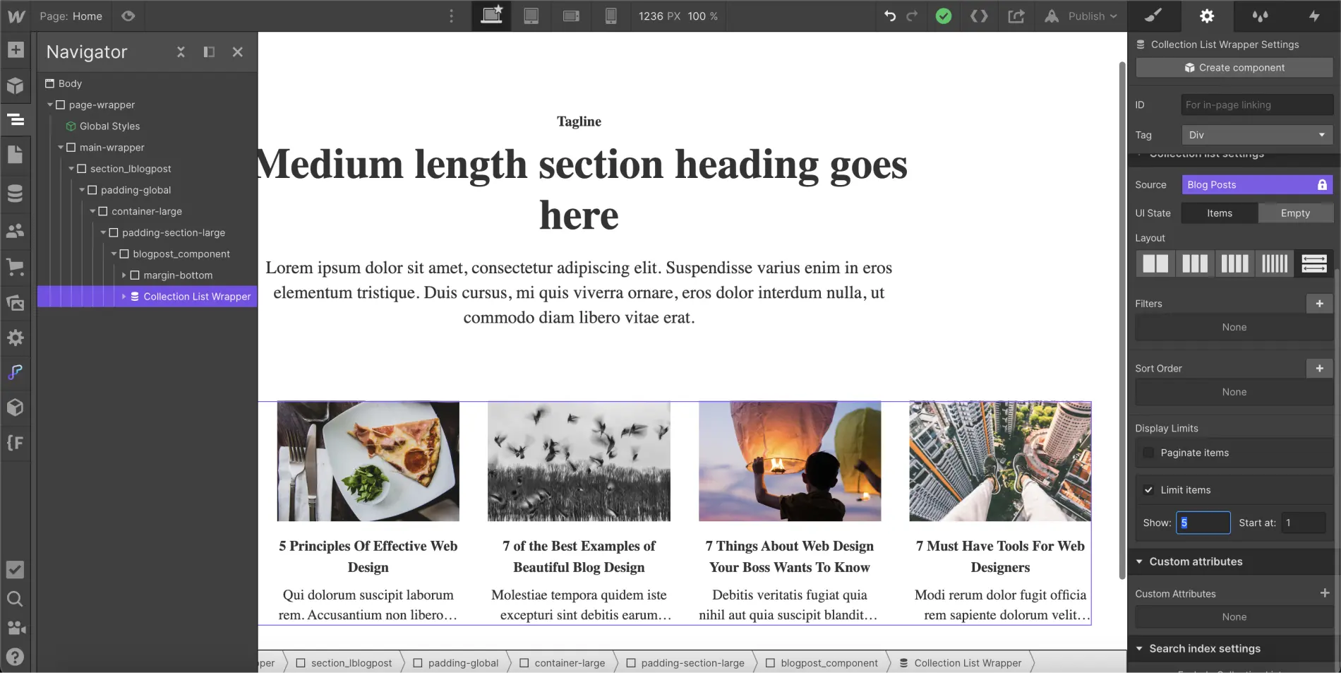
After inserting and customizing your collection, you will need to set an item limit for the collection. To do this, you should:
- Select your element "Collection List Wrapper" or "Collection List" or "Collection Item"
- Navigate to the settings of the element
- Click on "Limit items" in the "Display Limits" section
- Set a limit in Show (in our example above, our limit would be 5)
Step 3: Assign a Class to the Collection List Element
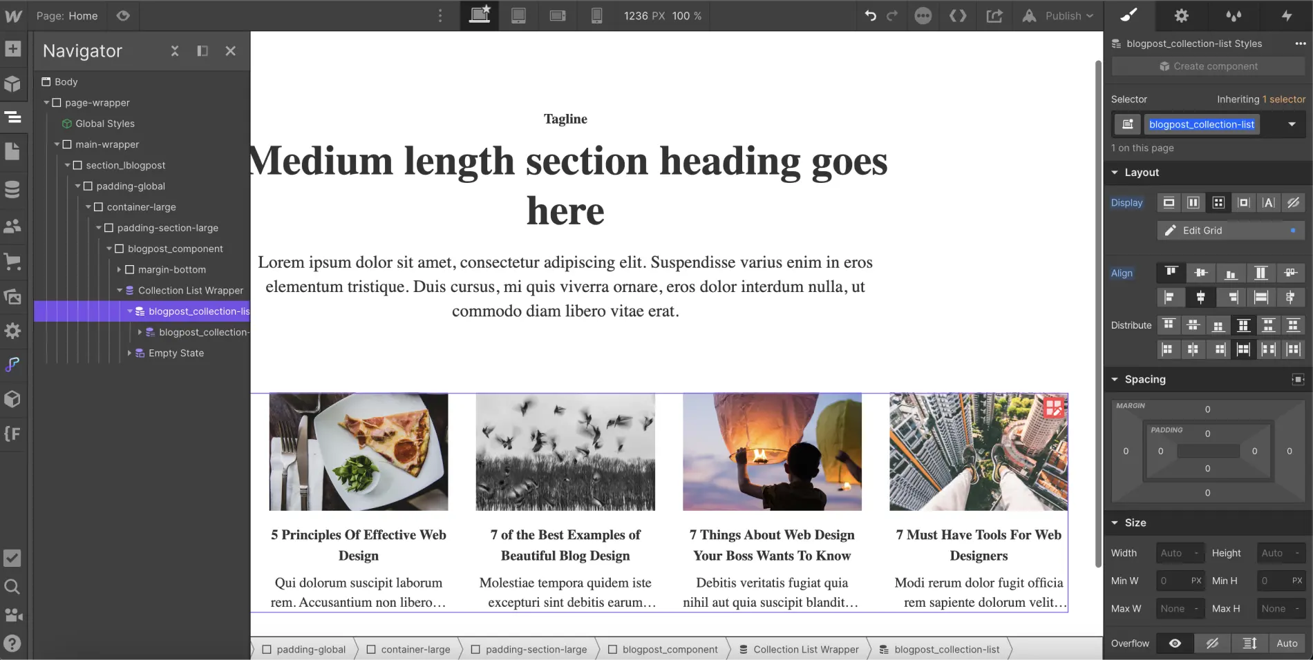
Once you have added an item limit, you can assign a class to your "Collection List" element (if not already done). For example, we could name it "blogpost_collection-list".
Step 4: Add CSS Code
Once your collection list is renamed, you can insert the following code into your project. If you want your project to be fully optimized, it's recommended to place the CSS code within the Head tags of your page (inside <!-- fs-richtext-ignore --><head> tag). You will then need to publish the project to see the changes.
You can also add an embed element to your page and paste the code inside it to view the modifications directly in the Designer.
Of course, you can modify this code to fit your needs:
- You can change the min-width to apply adjustments to larger or smaller screen sizes.
- You can modify .blogpost_collection-list to match the name of your item list class.
- You can replace the 4 in "n+4" with another number to hide more or fewer items.
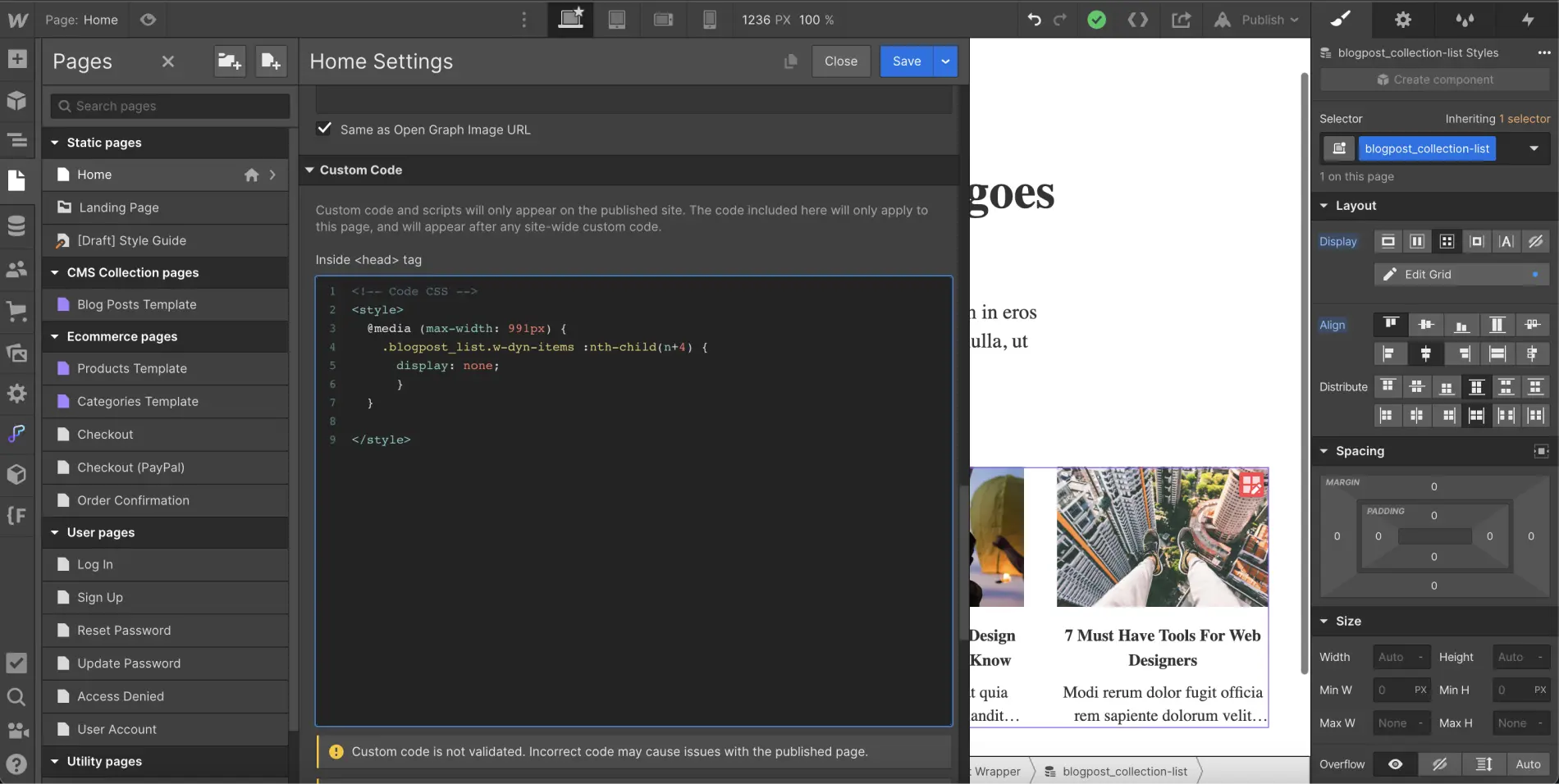
This snippet of code allows you to vary the number of items displayed based on a specific screen size and helps prevent design issues on certain devices.
If this tutorial has helped you, you can discover more helpful tips for developing in Webflow.
.webp)


.webp)